Migrate stake to Arbitrum
.
Not present in production builds. Safe no-op in prod. */
body {
padding: 0 !important;
}
/* Colors Used
#3CB540 - Jade Green
#2b9a66 - Light Green
#18794E - Dark Green
Complementary Greens
See https://coolors.co/004225-1a794e-08a045-3cb540-62ba4f
#004225 - Deep Forrest
#1A794E - Turf Green
#08A045 - Medium Jungle
#3CB540 - Jade Green
#6BBF59 - Moss Green
See https://coolors.co/0c0c0c-073b3a-1a794e-08a045-6bbf59
#0C0C0C - Onyx Black
#073B3A - Dark Teal
#1A794E - Turf Green
#08A045 - Medium Jungle
#6BBF59 - Moss Green
See https://coolors.co/fffffa-073b3a-1a794e-08a045-6bbf59
#FFFFFA - Porcelain
#073B3A - Dark Teal
#1A794E - Turf Green
#08A045 - Medium Jungle
#6BBF59 - Moss Green
Pink Offset Colour
See https://coolors.co/073b3a-1a794e-f61067-08a045-6bbf59
#F61067 - Razzmatazz Pink
#073B3A - Dark Teal
#1A794E - Turf Green
#08A045 - Medium Jungle
#6BBF59 - Moss Green
*/
/* ============================================
GLOBAL THEME VARIABLES
Component governance source of truth
============================================ */
:root {
--lp-color-accent: #3cb540;
--lp-color-accent-strong: #18794e;
--lp-color-accent-soft: #6bbf59;
--lp-color-accent-bright: #5dd662;
--lp-color-accent-brightest: #a0f0a5;
--lp-color-arbitrum: #3ea6f8;
--lp-color-text-primary: #181c18;
--lp-color-text-secondary: #717571;
--lp-color-text-muted: #9ca3af;
--lp-color-bg-page: #ffffff;
--lp-color-bg-card: #f9fafb;
--lp-color-bg-elevated: #f3f6f4;
--lp-color-bg-subtle: rgba(24, 28, 24, 0.04);
--lp-color-bg-overlay: rgba(12, 12, 12, 0.5);
--lp-color-border-default: #e5e7eb;
--lp-color-border-strong: rgba(24, 28, 24, 0.18);
--lp-color-border-inverse: rgba(255, 255, 255, 0.5);
--lp-color-on-accent: #ffffff;
--lp-color-link: #18794e;
--lp-color-link-hover: #004225;
--lp-color-brand-discord: #5865f2;
--lp-color-brand-forum: #00aeef;
--lp-color-brand-github: #181c18;
--lp-color-brand-x: #181c18;
--lp-color-brand-globe: #00c0ff;
--lp-color-brand-twitch: #9048ff;
--lp-color-brand-youtube: #ff0034;
--lp-color-brand-instagram: #dc2275;
--lp-color-brand-linkedin: #0189df;
--lp-color-brand-preview: #b636dd;
--lp-color-brand-coming-soon: #ef1a73;
--lp-color-brand-linux: #ff9a0e;
--lp-color-brand-windows: #14bbf7;
--lp-color-brand-macos: #60ba47;
--lp-color-status-good: #22c55e;
--lp-color-status-warn: #fbbf24;
--lp-color-status-bad: #ef4444;
--lp-spacing-1: 0.25rem;
--lp-spacing-2: 0.5rem;
--lp-spacing-3: 0.75rem;
--lp-spacing-4: 1rem;
--lp-spacing-6: 1.5rem;
--lp-spacing-8: 2rem;
--lp-spacing-px-3: 3px;
--lp-spacing-px-4: 4px;
--lp-spacing-px-6: 6px;
--lp-spacing-px-8: 8px;
--lp-spacing-px-12: 12px;
--lp-font-sans: 'Inter', 'Segoe UI', sans-serif;
--lp-font-mono: 'SFMono-Regular', 'SF Mono', 'Menlo', monospace;
--lp-radius-sm: 0.25rem;
--lp-radius-md: 0.5rem;
--lp-radius-lg: 0.75rem;
--lp-shadow-card: 0 8px 24px rgba(24, 28, 24, 0.08);
--lp-z-base: 1;
--lp-z-overlay: 10;
--lp-z-modal: 50;
/* Legacy aliases maintained during migration */
--accent: var(--lp-color-accent);
--accent-dark: var(--lp-color-accent-strong);
--hero-text: var(--lp-color-text-primary);
--text: var(--lp-color-text-secondary);
--text-secondary: var(--lp-color-text-secondary);
--muted-text: var(--lp-color-text-muted);
--background: var(--lp-color-bg-page);
--card-background: var(--lp-color-bg-card);
--background-highlight: var(--lp-color-bg-subtle);
--border: var(--lp-color-border-default);
--button-text: var(--lp-color-on-accent);
--page-header-description-color: var(--lp-color-text-secondary);
--arbitrum: var(--lp-color-arbitrum);
}
.dark {
--lp-color-accent: #2b9a66;
--lp-color-accent-strong: #18794e;
--lp-color-accent-soft: #3cb540;
--lp-color-accent-bright: #5dd662;
--lp-color-accent-brightest: #7fe584;
--lp-color-text-primary: #e0e4e0;
--lp-color-text-secondary: #a0a4a0;
--lp-color-text-muted: #6b7280;
--lp-color-bg-page: #0d0d0d;
--lp-color-bg-card: #1a1a1a;
--lp-color-bg-elevated: #141a16;
--lp-color-bg-subtle: rgba(255, 255, 255, 0.1);
--lp-color-bg-overlay: rgba(0, 0, 0, 0.5);
--lp-color-border-default: #333333;
--lp-color-border-strong: rgba(255, 255, 255, 0.3);
--lp-color-border-inverse: rgba(255, 255, 255, 0.5);
--lp-color-on-accent: #ffffff;
--lp-color-link: #5dd662;
--lp-color-link-hover: #a0f0a5;
--lp-color-brand-github: #f0f0f0;
/* Legacy aliases maintained during migration */
--accent: var(--lp-color-accent);
--accent-dark: var(--lp-color-accent-strong);
--hero-text: var(--lp-color-text-primary);
--text: var(--lp-color-text-secondary);
--text-secondary: var(--lp-color-text-secondary);
--muted-text: var(--lp-color-text-muted);
--background: var(--lp-color-bg-page);
--card-background: var(--lp-color-bg-card);
--background-highlight: var(--lp-color-bg-subtle);
--border: var(--lp-color-border-default);
--button-text: var(--lp-color-on-accent);
--page-header-description-color: var(--lp-color-text-secondary);
--arbitrum: var(--lp-color-arbitrum);
}
/* ============================================ */
/* Code block themes
hiki codeblock themes:
Popular Dark Themes:
github-dark (what you have now)
github-dark-dimmed
github-dark-high-contrast
dracula
dracula-soft
monokai
nord
one-dark-pro
poimandres
rose-pine
everforest-dark
vitesse-dark
Popular Light Themes:
github-light (what you have now)
github-light-high-contrast
solarized-light
rose-pine-dawn
everforest-light
vitesse-light */
/* img[alt="dark logo"],
img[alt="light logo"] {
max-width: 180px;
} */
/* V2 TEST */
/* a.nav-tabs-item[href="/pages/resources/resources_hub.mdx"],
a.nav-tabs-item[href="/pages/08_help/README"] {
color: rgba(255, 90, 90, 0.342) !important;
} */
/* Make the nav-tabs container full width */
.nav-tabs {
width: 100%;
justify-content: flex-start;
}
/* Fix Mintlify content width and centering.
Regular pages: balance padding + widen inner cap.
Portal/frame pages: balance padding (smaller) + widen inner cap for full-width hero. */
@media (min-width: 1024px) {
/* Regular pages */
#content-container:not(:has(.frame-mode-hero-full)):not(
:has(.frame-mode-container)
) {
padding-left: 3rem !important;
padding-right: 3rem !important;
}
#content-container:not(:has(.frame-mode-hero-full)):not(
:has(.frame-mode-container)
)
> .max-w-5xl {
max-width: 72rem !important;
}
/* Portal/frame pages — tighter balanced padding, wider inner cap */
#content-container:has(.frame-mode-hero-full),
#content-container:has(.frame-mode-container) {
padding-left: 2rem !important;
padding-right: 2rem !important;
}
#content-container:has(.frame-mode-hero-full) > .max-w-5xl,
#content-container:has(.frame-mode-container) > .max-w-5xl {
max-width: 80rem !important;
}
}
#navbar > div.z-10.mx-auto.relative > div.hidden.lg\:flex.px-12.h-12 > div {
column-gap: 2rem !important;
}
a.nav-tabs-item[href*='/internal/'] {
margin-left: 1rem;
margin-right: -1rem;
padding-right: 0;
border-bottom-color: transparent !important;
}
/* .gap-x-6 {
column-gap: 2rem !important;
} */
/* .nav-tabs h-full flex text-sm gap-x-6 {
column-gap: 2rem !important;
} */
/* Push Resource HUB to the right and style as outlined button */
a.nav-tabs-item[href$='/resources/redirect'],
a.nav-tabs-item[href$='/resources/portal'],
a.nav-tabs-item[href$='/07_resources/redirect'],
a.nav-tabs-item[href$='/07_resources/portal'] {
margin-left: auto;
background-color: transparent;
border: 1px solid var(--accent) !important;
padding: 4px 8px;
border-radius: 4px;
font-size: 0.7rem;
height: auto !important;
align-self: center;
margin-right: -2rem;
}
/* Color the text */
/* a.nav-tabs-item[href="/v2/resources/resources_hub"] {
color: #2b9a66 !important;
} */
/* Shrink & color the icon */
a.nav-tabs-item[href$='/resources/redirect'] svg,
a.nav-tabs-item[href$='/resources/portal'] svg,
a.nav-tabs-item[href$='/07_resources/redirect'] svg,
a.nav-tabs-item[href$='/07_resources/portal'] svg,
a.nav-tabs-item[href$='/07_resources/resources_hub'] svg {
height: 0.75rem;
width: 0.75rem;
/* background-color: #2b9a66 !important; */
}
/* Hide the underline on the button */
a.nav-tabs-item[href$='/resources/redirect'] > div:last-child,
a.nav-tabs-item[href$='/resources/portal'] > div:last-child,
a.nav-tabs-item[href$='/07_resources/redirect'] > div:last-child,
a.nav-tabs-item[href$='/07_resources/portal'] > div:last-child,
a.nav-tabs-item[href$='/07_resources/resources_hub'] > div:last-child {
display: none;
}
/* Stack footer links vertically */
#footer .flex-col .flex.gap-4 {
flex-direction: column !important;
gap: 0rem !important;
}
/* Reduce footer padding */
#footer > div {
padding-top: 2rem !important;
padding-bottom: 1rem !important;
}
/* Accessibility: prevent hidden assistant sheet from receiving focus */
#chat-assistant-sheet[aria-hidden='true'] {
display: none !important;
}
/* Accessibility: ensure CTA buttons meet minimum target size */
button.text-left.text-gray-600.text-sm.font-medium {
min-height: 24px;
padding-top: 4px;
padding-bottom: 4px;
}
/* #footer > div > div:first-child {
display: flex;
flex-direction: row !important;
color: red !important;
}
#footer > div > div:first-child > div {
display: flex;
flex-direction: row !important;
color: green !important;
} */
/* Fix bad styling of cards with arrows */
[data-component-part='card-content-container'] {
padding-right: 2.5rem; /* Creates space for the arrow */
}
/* Reposition View component dropdown */
/*
To find the correct selector:
1. Open your page with View components in the browser
2. Right-click on the dropdown in the top-right corner
3. Select "Inspect Element"
4. Find the class name or data attribute
5. Replace the selector below with the actual one
*/
/* Common possible selectors - uncomment and adjust the one that works */
/* Option 1: If it has a data attribute */
/* [data-view-dropdown] {
position: relative !important;
top: 60px !important;
right: 20px !important;
} */
/* Option 2: If it's in a fixed container */
/* .fixed [class*="view"] {
position: relative !important;
top: 60px !important;
} */
/* Option 3: Target by position (fixed elements in top-right) */
/* .fixed.top-0.right-0 [class*="select"],
.fixed.top-0.right-0 [class*="dropdown"] {
position: relative !important;
top: 60px !important;
margin-right: 20px !important;
} */
/* Option 4: Move it inline with content instead of fixed position */
/* Replace 'ACTUAL_SELECTOR' with the real class name from browser inspection */
/* ACTUAL_SELECTOR {
position: static !important;
display: inline-block !important;
margin-bottom: 20px !important;
} */
.code-block > div > div > svg {
background-color: #18794e !important;
}
/* Error 404 Styling */
#error-description > span > div > div {
border: 1px solid #18794e !important;
}
body
> div.relative.antialiased.text-gray-500.dark\:text-gray-400
> div.peer-\[\.is-not-custom\]\:lg\:flex.peer-\[\.is-custom\]\:\[\&\>div\:first-child\]\:\!hidden.peer-\[\.is-custom\]\:\[\&\>div\:first-child\]\:sm\:\!hidden.peer-\[\.is-custom\]\:\[\&\>div\:first-child\]\:md\:\!hidden.peer-\[\.is-custom\]\:\[\&\>div\:first-child\]\:lg\:\!hidden.peer-\[\.is-custom\]\:\[\&\>div\:first-child\]\:xl\:\!hidden
> div.flex.flex-col.items-center.justify-center.w-full.max-w-lg.overflow-x-hidden.mx-auto.py-48.px-5.text-center.\*\:text-center.gap-y-8.not-found-container
> div {
margin-top: -5rem;
}
#error-description
> span
> div
> div
> div.relative.rounded-xl.overflow-hidden.flex.justify-center
> img {
width: 500px;
aspect-ratio: 4 / 3;
object-fit: cover;
/* border: 1px solid #fff; */
}
/* Step List Color Icons Styling */
/* #content > div.steps > div > div.absolute.ml-\[-13px\].py-2 > div {
background-color: #18794e !important;
} */
/* Step List Color Titles */
#content
> div.steps.ml-3\.5.mt-10.mb-6
> div
> div.w-full.overflow-hidden.pl-8.pr-px
> p {
color: #2b9a66 !important;
}
/* View Dropdown */
/* #radix-_R_5slubt9fen9fdb_ */
/* Turn off bg-white in dark mode for multi-view dropdown (PALM THEME BUG) */
.dark .bg-white\/\[0\.95\].multi-view-dropdown-trigger {
background-color: transparent !important;
background: none !important;
}
/* Sidebar collapse button - bigger and easier to click */
/* #sidebar button.absolute {
min-width: 2.5rem !important;
min-height: 2.5rem !important;
padding: 0.75rem !important;
z-index: 100 !important;
} */
/* Override US flag with UK flag in language selector */
/* Hide the original img and use background-image instead */
/* #localization-select-trigger img[alt="US"],
#localization-select-item-en img[alt="US"],
img[alt="US"][src*="flags/US.svg"] {
opacity: 0 !important;
position: relative !important;
}
#localization-select-trigger img[alt="US"]::before,
#localization-select-item-en img[alt="US"]::before,
img[alt="US"][src*="flags/US.svg"]::before {
content: "" !important;
position: absolute !important;
top: 0 !important;
left: 0 !important;
width: 100% !important;
height: 100% !important;
background-image: url("/snippets/assets/media/images/site/united-kingdom-flag-icon.svg") !important;
background-size: cover !important;
background-position: center !important;
border-radius: 50% !important;
opacity: 1 !important;
} */
/* Hide the panel on frame mode pages (MINTLIFY SUCKS) */
/* Hide empty table of contents layout only when it's empty */
#table-of-contents-layout:empty,
#content-side-layout:has(#table-of-contents-layout:empty) {
display: none;
}
/* DynamicTable: force fixed layout so columnWidths prop values take effect.
Mintlify's Tailwind prose resets table-layout to auto — !important required. */
[data-docs-dynamic-table] {
table-layout: fixed !important;
}
/* StyledTable should sit flush inside its own border shell.
Mint wraps rendered tables in a scroll container with vertical padding,
which creates a false gap above/below the header row. */
[data-docs-styled-table-shell] > div {
padding-top: 0 !important;
padding-bottom: 0 !important;
margin-top: 0 !important;
margin-bottom: 0 !important;
}
/* BorderedBox should own its internal spacing.
Trim default block margins on the first/last rendered child so headings
and paragraphs do not add a false gap inside the padded shell. */
[data-docs-bordered-box] > :first-child {
margin-top: 0 !important;
}
[data-docs-bordered-box] > :last-child {
margin-bottom: 0 !important;
}
[data-docs-bordered-box][data-accent-bar]::before {
content: "";
position: absolute;
top: 0;
bottom: 0;
left: 0;
width: 4px;
background-color: var(--accent-bar-color);
border-radius: inherit;
border-top-right-radius: 0;
border-bottom-right-radius: 0;
}
/* Frame mode container - 80% of #content-container width, centered */
/* Breaks out of #content padding to center in full #content-container */
.frame-mode-container {
width: calc(100% + 96px + 20px); /* 976px */
margin-left: -96px;
margin-right: -20px;
margin-bottom: 2rem;
padding-left: 15%; /* Adjust this for desired content width */
padding-right: 15%; /* Adjust this for desired content width */
box-sizing: border-box;
}
/* Frame mode container inside hero - already broken out, so reset */
.frame-mode-hero-full .frame-mode-container {
width: 100%;
margin-left: 0;
margin-right: 0;
padding-left: 0%;
padding-right: 0%;
}
/* Pagination on frame mode pages ONLY - match container padding */
[data-page-mode='frame'] #pagination {
width: calc(100% + 96px + 20px);
margin-left: -96px;
margin-right: -20px;
padding-left: calc((100% + 96px + 20px) * 0.1 + 96px);
padding-right: calc((100% + 96px + 20px) * 0.1 + 20px);
box-sizing: border-box;
}
/* Hero full width - breaks out of #content padding to fill #content-container */
.frame-mode-hero-full {
width: calc(100% + 96px + 20px);
margin-left: -96px;
margin-right: -20px;
position: relative;
}
@media (max-width: 1023px) {
.frame-mode-container {
width: 100%;
margin-left: 0;
margin-right: 0;
padding-left: 1rem;
padding-right: 1rem;
}
[data-page-mode='frame'] #pagination {
width: 100%;
margin-left: 0;
margin-right: 0;
padding-left: 1rem;
padding-right: 1rem;
}
.frame-mode-hero-full {
width: 100%;
margin-left: 0;
margin-right: 0;
}
}
#starfield {
position: absolute;
inset: 0;
width: 100%;
height: 100%;
pointer-events: none;
z-index: 0;
}
/* Target the card content container */
.frame-mode-hero-full [data-component-part='card-content-container'] {
padding-top: 0.5rem;
padding-bottom: 0.5rem;
padding-left: 1rem;
padding-right: 2.5rem; /* Space for arrow icon (0.75rem right + icon width ~1rem + margin) */
}
/* Target the arrow icon */
.frame-mode-hero-full #card-link-arrow-icon {
top: 0.75rem;
right: 0.75rem;
}
/* #content > div.frame-mode-hero-full > div.frame-mode-container > div > div:nth-child(2) > div > div > div:nth-child(4) > a > div {
padding-top: 0.5rem;
padding-bottom: 0.5rem;
}
#content > div.frame-mode-hero-full > div.frame-mode-container > div > div:nth-child(2) > div > div > div:nth-child(4) > a > div > #card-link-arrow-icon {
top: 0.75rem;
right: 0.75rem;
} */
/* ============================================
ACCESSIBILITY — Focus indicators
============================================ */
input:focus-visible,
select:focus-visible,
textarea:focus-visible,
button:focus-visible,
a:focus-visible,
[tabindex]:focus-visible {
outline: 2px solid var(--accent) !important;
outline-offset: 2px;
}
/* ============================================
ACCESSIBILITY — Responsive breakpoints
============================================ */
@media (max-width: 767px) {
.frame-mode-hero-full {
width: 100%;
max-width: 100%;
overflow-x: hidden;
}
}
@media (max-width: 480px) {
#content {
padding-left: 1rem;
padding-right: 1rem;
}
}
/* ============================================
UTILITY CLASSES — inline element styling
Used where components can't replace inline spans
(e.g., inside Mintlify
, components)
============================================ */
.lp-inline-flex {
display: flex;
align-items: center;
}
.lp-text-muted {
color: var(--lp-color-text-secondary);
}
.lp-text-italic-muted {
font-style: italic;
color: var(--lp-color-text-secondary);
}
.lp-inline-flex-gap {
display: flex;
align-items: center;
gap: 0.2rem;
}
.lp-link-underline {
border-bottom: 1.5px solid var(--lp-color-text-primary);
color: var(--lp-color-text-primary);
padding-bottom: 0.25rem;
}
This guide is applicable to delegators who delegated their LPT to an
orchestrator on the Ethereum mainnet prior to February 14th, 2022. Once you have
successfully completed the migration, this guide is no longer applicable and you
will use Arbitrum in lieu of Ethereum Mainnet for all protocol actions.
Claiming your delegated stake and earned ETH on Arbitrum is highly encouraged
to ensure that (1) you continue earning inflationary rewards and fees and (2)
you will be able to withdraw any currently delegated stake and earned ETH
fees. As of February 14th, 2022, withdrawals on the Ethereum Mainnet will be
disabled and all inflationary rewards and ETH fees will be disbursed on
Arbitrum.
Prerequisites for all chains
Before using this guide, you will need make sure your Arbitrum wallet has
enough arbETH to cover gas for the claim transaction. If you do not have
arbETH in your wallet, you will need to add some using one of the bridges or
on-ramps listed here .
The migration must be completed using the Livepeer explorer
If you use a contract account rather than an EOA : You will need to
interact directly with the Migrator contract methods. Please use the guide
here . If you don’t know
what this means, it probably doesn’t apply to you.
Claiming via the Explorer
Navigate to the Livepeer Explorer . If you
have not connected the wallet that you used to delegate your LPT, connect it
using the prompt in the upper left hand corner. If you haven’t switched your
network to Arbitrum, you’ll be prompted to do so.
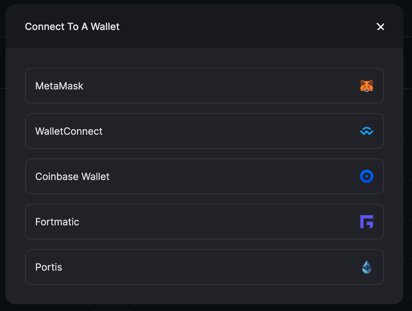
There are a few options for connecting a wallet to Arbitrum. The wallet you choose should be the same one with which you originally delegated your LPT on the Ethereum mainnet. It should also contain a small amount of arbETH to pay for the claim on Arbitrum.
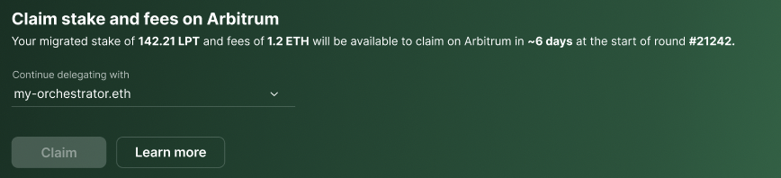
Claim your stake, rewards, and fees Click Claim to initiate a transaction that will claim your stake, rewards
and fees.
If your orchestrator has not migrated and has not conveyed plans to migrate,
you will see a prompt to choose a new orchestrator.
View your profile Once the claim transaction has been confirmed (this usually takes a few
seconds on Arbitrum), you see a link to your profile. Here, you’ll be able
to see your newly claimed balances.
You will see an Arbiscan link to the transaction id
in case you want to look at the submitted transaction.
Last modified on April 11, 2026