. Not present in production builds. Safe no-op in prod. */ body { padding: 0 !important; } /* Colors Used #3CB540 - Jade Green #2b9a66 - Light Green #18794E - Dark Green Complementary Greens See https://coolors.co/004225-1a794e-08a045-3cb540-62ba4f #004225 - Deep Forrest #1A794E - Turf Green #08A045 - Medium Jungle #3CB540 - Jade Green #6BBF59 - Moss Green See https://coolors.co/0c0c0c-073b3a-1a794e-08a045-6bbf59 #0C0C0C - Onyx Black #073B3A - Dark Teal #1A794E - Turf Green #08A045 - Medium Jungle #6BBF59 - Moss Green See https://coolors.co/fffffa-073b3a-1a794e-08a045-6bbf59 #FFFFFA - Porcelain #073B3A - Dark Teal #1A794E - Turf Green #08A045 - Medium Jungle #6BBF59 - Moss Green Pink Offset Colour See https://coolors.co/073b3a-1a794e-f61067-08a045-6bbf59 #F61067 - Razzmatazz Pink #073B3A - Dark Teal #1A794E - Turf Green #08A045 - Medium Jungle #6BBF59 - Moss Green */ /* ============================================ GLOBAL THEME VARIABLES Component governance source of truth ============================================ */ :root { --lp-color-accent: #3cb540; --lp-color-accent-strong: #18794e; --lp-color-accent-soft: #6bbf59; --lp-color-accent-bright: #5dd662; --lp-color-accent-brightest: #a0f0a5; --lp-color-arbitrum: #3ea6f8; --lp-color-text-primary: #181c18; --lp-color-text-secondary: #717571; --lp-color-text-muted: #9ca3af; --lp-color-bg-page: #ffffff; --lp-color-bg-card: #f9fafb; --lp-color-bg-elevated: #f3f6f4; --lp-color-bg-subtle: rgba(24, 28, 24, 0.04); --lp-color-bg-overlay: rgba(12, 12, 12, 0.5); --lp-color-border-default: #e5e7eb; --lp-color-border-strong: rgba(24, 28, 24, 0.18); --lp-color-border-inverse: rgba(255, 255, 255, 0.5); --lp-color-on-accent: #ffffff; --lp-color-link: #18794e; --lp-color-link-hover: #004225; --lp-color-brand-discord: #5865f2; --lp-color-brand-forum: #00aeef; --lp-color-brand-github: #181c18; --lp-color-brand-x: #181c18; --lp-color-brand-globe: #00c0ff; --lp-color-brand-twitch: #9048ff; --lp-color-brand-youtube: #ff0034; --lp-color-brand-instagram: #dc2275; --lp-color-brand-linkedin: #0189df; --lp-color-brand-preview: #b636dd; --lp-color-brand-coming-soon: #ef1a73; --lp-color-brand-linux: #ff9a0e; --lp-color-brand-windows: #14bbf7; --lp-color-brand-macos: #60ba47; --lp-color-status-good: #22c55e; --lp-color-status-warn: #fbbf24; --lp-color-status-bad: #ef4444; --lp-spacing-1: 0.25rem; --lp-spacing-2: 0.5rem; --lp-spacing-3: 0.75rem; --lp-spacing-4: 1rem; --lp-spacing-6: 1.5rem; --lp-spacing-8: 2rem; --lp-spacing-px-3: 3px; --lp-spacing-px-4: 4px; --lp-spacing-px-6: 6px; --lp-spacing-px-8: 8px; --lp-spacing-px-12: 12px; --lp-font-sans: 'Inter', 'Segoe UI', sans-serif; --lp-font-mono: 'SFMono-Regular', 'SF Mono', 'Menlo', monospace; --lp-radius-sm: 0.25rem; --lp-radius-md: 0.5rem; --lp-radius-lg: 0.75rem; --lp-shadow-card: 0 8px 24px rgba(24, 28, 24, 0.08); --lp-z-base: 1; --lp-z-overlay: 10; --lp-z-modal: 50; /* Legacy aliases maintained during migration */ --accent: var(--lp-color-accent); --accent-dark: var(--lp-color-accent-strong); --hero-text: var(--lp-color-text-primary); --text: var(--lp-color-text-secondary); --text-secondary: var(--lp-color-text-secondary); --muted-text: var(--lp-color-text-muted); --background: var(--lp-color-bg-page); --card-background: var(--lp-color-bg-card); --background-highlight: var(--lp-color-bg-subtle); --border: var(--lp-color-border-default); --button-text: var(--lp-color-on-accent); --page-header-description-color: var(--lp-color-text-secondary); --arbitrum: var(--lp-color-arbitrum); } .dark { --lp-color-accent: #2b9a66; --lp-color-accent-strong: #18794e; --lp-color-accent-soft: #3cb540; --lp-color-accent-bright: #5dd662; --lp-color-accent-brightest: #7fe584; --lp-color-text-primary: #e0e4e0; --lp-color-text-secondary: #a0a4a0; --lp-color-text-muted: #6b7280; --lp-color-bg-page: #0d0d0d; --lp-color-bg-card: #1a1a1a; --lp-color-bg-elevated: #141a16; --lp-color-bg-subtle: rgba(255, 255, 255, 0.1); --lp-color-bg-overlay: rgba(0, 0, 0, 0.5); --lp-color-border-default: #333333; --lp-color-border-strong: rgba(255, 255, 255, 0.3); --lp-color-border-inverse: rgba(255, 255, 255, 0.5); --lp-color-on-accent: #ffffff; --lp-color-link: #5dd662; --lp-color-link-hover: #a0f0a5; --lp-color-brand-github: #f0f0f0; /* Legacy aliases maintained during migration */ --accent: var(--lp-color-accent); --accent-dark: var(--lp-color-accent-strong); --hero-text: var(--lp-color-text-primary); --text: var(--lp-color-text-secondary); --text-secondary: var(--lp-color-text-secondary); --muted-text: var(--lp-color-text-muted); --background: var(--lp-color-bg-page); --card-background: var(--lp-color-bg-card); --background-highlight: var(--lp-color-bg-subtle); --border: var(--lp-color-border-default); --button-text: var(--lp-color-on-accent); --page-header-description-color: var(--lp-color-text-secondary); --arbitrum: var(--lp-color-arbitrum); } /* ============================================ */ /* Code block themes hiki codeblock themes: Popular Dark Themes: github-dark (what you have now) github-dark-dimmed github-dark-high-contrast dracula dracula-soft monokai nord one-dark-pro poimandres rose-pine everforest-dark vitesse-dark Popular Light Themes: github-light (what you have now) github-light-high-contrast solarized-light rose-pine-dawn everforest-light vitesse-light */ /* img[alt="dark logo"], img[alt="light logo"] { max-width: 180px; } */ /* V2 TEST */ /* a.nav-tabs-item[href="/pages/resources/resources_hub.mdx"], a.nav-tabs-item[href="/pages/08_help/README"] { color: rgba(255, 90, 90, 0.342) !important; } */ /* Make the nav-tabs container full width */ .nav-tabs { width: 100%; justify-content: flex-start; } /* Fix Mintlify content width and centering. Regular pages: balance padding + widen inner cap. Portal/frame pages: balance padding (smaller) + widen inner cap for full-width hero. */ @media (min-width: 1024px) { /* Regular pages */ #content-container:not(:has(.frame-mode-hero-full)):not( :has(.frame-mode-container) ) { padding-left: 3rem !important; padding-right: 3rem !important; } #content-container:not(:has(.frame-mode-hero-full)):not( :has(.frame-mode-container) ) > .max-w-5xl { max-width: 72rem !important; } /* Portal/frame pages — tighter balanced padding, wider inner cap */ #content-container:has(.frame-mode-hero-full), #content-container:has(.frame-mode-container) { padding-left: 2rem !important; padding-right: 2rem !important; } #content-container:has(.frame-mode-hero-full) > .max-w-5xl, #content-container:has(.frame-mode-container) > .max-w-5xl { max-width: 80rem !important; } } #navbar > div.z-10.mx-auto.relative > div.hidden.lg\:flex.px-12.h-12 > div { column-gap: 2rem !important; } a.nav-tabs-item[href*='/internal/'] { margin-left: 1rem; margin-right: -1rem; padding-right: 0; border-bottom-color: transparent !important; } /* .gap-x-6 { column-gap: 2rem !important; } */ /* .nav-tabs h-full flex text-sm gap-x-6 { column-gap: 2rem !important; } */ /* Push Resource HUB to the right and style as outlined button */ a.nav-tabs-item[href$='/resources/redirect'], a.nav-tabs-item[href$='/resources/portal'], a.nav-tabs-item[href$='/07_resources/redirect'], a.nav-tabs-item[href$='/07_resources/portal'] { margin-left: auto; background-color: transparent; border: 1px solid var(--accent) !important; padding: 4px 8px; border-radius: 4px; font-size: 0.7rem; height: auto !important; align-self: center; margin-right: -2rem; } /* Color the text */ /* a.nav-tabs-item[href="/v2/resources/resources_hub"] { color: #2b9a66 !important; } */ /* Shrink & color the icon */ a.nav-tabs-item[href$='/resources/redirect'] svg, a.nav-tabs-item[href$='/resources/portal'] svg, a.nav-tabs-item[href$='/07_resources/redirect'] svg, a.nav-tabs-item[href$='/07_resources/portal'] svg, a.nav-tabs-item[href$='/07_resources/resources_hub'] svg { height: 0.75rem; width: 0.75rem; /* background-color: #2b9a66 !important; */ } /* Hide the underline on the button */ a.nav-tabs-item[href$='/resources/redirect'] > div:last-child, a.nav-tabs-item[href$='/resources/portal'] > div:last-child, a.nav-tabs-item[href$='/07_resources/redirect'] > div:last-child, a.nav-tabs-item[href$='/07_resources/portal'] > div:last-child, a.nav-tabs-item[href$='/07_resources/resources_hub'] > div:last-child { display: none; } /* Stack footer links vertically */ #footer .flex-col .flex.gap-4 { flex-direction: column !important; gap: 0rem !important; } /* Reduce footer padding */ #footer > div { padding-top: 2rem !important; padding-bottom: 1rem !important; } /* Accessibility: prevent hidden assistant sheet from receiving focus */ #chat-assistant-sheet[aria-hidden='true'] { display: none !important; } /* Accessibility: ensure CTA buttons meet minimum target size */ button.text-left.text-gray-600.text-sm.font-medium { min-height: 24px; padding-top: 4px; padding-bottom: 4px; } /* #footer > div > div:first-child { display: flex; flex-direction: row !important; color: red !important; } #footer > div > div:first-child > div { display: flex; flex-direction: row !important; color: green !important; } */ /* Fix bad styling of cards with arrows */ [data-component-part='card-content-container'] { padding-right: 2.5rem; /* Creates space for the arrow */ } /* Reposition View component dropdown */ /* To find the correct selector: 1. Open your page with View components in the browser 2. Right-click on the dropdown in the top-right corner 3. Select "Inspect Element" 4. Find the class name or data attribute 5. Replace the selector below with the actual one */ /* Common possible selectors - uncomment and adjust the one that works */ /* Option 1: If it has a data attribute */ /* [data-view-dropdown] { position: relative !important; top: 60px !important; right: 20px !important; } */ /* Option 2: If it's in a fixed container */ /* .fixed [class*="view"] { position: relative !important; top: 60px !important; } */ /* Option 3: Target by position (fixed elements in top-right) */ /* .fixed.top-0.right-0 [class*="select"], .fixed.top-0.right-0 [class*="dropdown"] { position: relative !important; top: 60px !important; margin-right: 20px !important; } */ /* Option 4: Move it inline with content instead of fixed position */ /* Replace 'ACTUAL_SELECTOR' with the real class name from browser inspection */ /* ACTUAL_SELECTOR { position: static !important; display: inline-block !important; margin-bottom: 20px !important; } */ .code-block > div > div > svg { background-color: #18794e !important; } /* Error 404 Styling */ #error-description > span > div > div { border: 1px solid #18794e !important; } body > div.relative.antialiased.text-gray-500.dark\:text-gray-400 > div.peer-\[\.is-not-custom\]\:lg\:flex.peer-\[\.is-custom\]\:\[\&\>div\:first-child\]\:\!hidden.peer-\[\.is-custom\]\:\[\&\>div\:first-child\]\:sm\:\!hidden.peer-\[\.is-custom\]\:\[\&\>div\:first-child\]\:md\:\!hidden.peer-\[\.is-custom\]\:\[\&\>div\:first-child\]\:lg\:\!hidden.peer-\[\.is-custom\]\:\[\&\>div\:first-child\]\:xl\:\!hidden > div.flex.flex-col.items-center.justify-center.w-full.max-w-lg.overflow-x-hidden.mx-auto.py-48.px-5.text-center.\*\:text-center.gap-y-8.not-found-container > div { margin-top: -5rem; } #error-description > span > div > div > div.relative.rounded-xl.overflow-hidden.flex.justify-center > img { width: 500px; aspect-ratio: 4 / 3; object-fit: cover; /* border: 1px solid #fff; */ } /* Step List Color Icons Styling */ /* #content > div.steps > div > div.absolute.ml-\[-13px\].py-2 > div { background-color: #18794e !important; } */ /* Step List Color Titles */ #content > div.steps.ml-3\.5.mt-10.mb-6 > div > div.w-full.overflow-hidden.pl-8.pr-px > p { color: #2b9a66 !important; } /* View Dropdown */ /* #radix-_R_5slubt9fen9fdb_ */ /* Turn off bg-white in dark mode for multi-view dropdown (PALM THEME BUG) */ .dark .bg-white\/\[0\.95\].multi-view-dropdown-trigger { background-color: transparent !important; background: none !important; } /* Sidebar collapse button - bigger and easier to click */ /* #sidebar button.absolute { min-width: 2.5rem !important; min-height: 2.5rem !important; padding: 0.75rem !important; z-index: 100 !important; } */ /* Override US flag with UK flag in language selector */ /* Hide the original img and use background-image instead */ /* #localization-select-trigger img[alt="US"], #localization-select-item-en img[alt="US"], img[alt="US"][src*="flags/US.svg"] { opacity: 0 !important; position: relative !important; } #localization-select-trigger img[alt="US"]::before, #localization-select-item-en img[alt="US"]::before, img[alt="US"][src*="flags/US.svg"]::before { content: "" !important; position: absolute !important; top: 0 !important; left: 0 !important; width: 100% !important; height: 100% !important; background-image: url("/snippets/assets/media/images/site/united-kingdom-flag-icon.svg") !important; background-size: cover !important; background-position: center !important; border-radius: 50% !important; opacity: 1 !important; } */ /* Hide the panel on frame mode pages (MINTLIFY SUCKS) */ /* Hide empty table of contents layout only when it's empty */ #table-of-contents-layout:empty, #content-side-layout:has(#table-of-contents-layout:empty) { display: none; } /* DynamicTable: force fixed layout so columnWidths prop values take effect. Mintlify's Tailwind prose resets table-layout to auto — !important required. */ [data-docs-dynamic-table] { table-layout: fixed !important; } /* StyledTable should sit flush inside its own border shell. Mint wraps rendered tables in a scroll container with vertical padding, which creates a false gap above/below the header row. */ [data-docs-styled-table-shell] > div { padding-top: 0 !important; padding-bottom: 0 !important; margin-top: 0 !important; margin-bottom: 0 !important; } /* BorderedBox should own its internal spacing. Trim default block margins on the first/last rendered child so headings and paragraphs do not add a false gap inside the padded shell. */ [data-docs-bordered-box] > :first-child { margin-top: 0 !important; } [data-docs-bordered-box] > :last-child { margin-bottom: 0 !important; } [data-docs-bordered-box][data-accent-bar]::before { content: ""; position: absolute; top: 0; bottom: 0; left: 0; width: 4px; background-color: var(--accent-bar-color); border-radius: inherit; border-top-right-radius: 0; border-bottom-right-radius: 0; } /* Frame mode container - 80% of #content-container width, centered */ /* Breaks out of #content padding to center in full #content-container */ .frame-mode-container { width: calc(100% + 96px + 20px); /* 976px */ margin-left: -96px; margin-right: -20px; margin-bottom: 2rem; padding-left: 15%; /* Adjust this for desired content width */ padding-right: 15%; /* Adjust this for desired content width */ box-sizing: border-box; } /* Frame mode container inside hero - already broken out, so reset */ .frame-mode-hero-full .frame-mode-container { width: 100%; margin-left: 0; margin-right: 0; padding-left: 0%; padding-right: 0%; } /* Pagination on frame mode pages ONLY - match container padding */ [data-page-mode='frame'] #pagination { width: calc(100% + 96px + 20px); margin-left: -96px; margin-right: -20px; padding-left: calc((100% + 96px + 20px) * 0.1 + 96px); padding-right: calc((100% + 96px + 20px) * 0.1 + 20px); box-sizing: border-box; } /* Hero full width - breaks out of #content padding to fill #content-container */ .frame-mode-hero-full { width: calc(100% + 96px + 20px); margin-left: -96px; margin-right: -20px; position: relative; } @media (max-width: 1023px) { .frame-mode-container { width: 100%; margin-left: 0; margin-right: 0; padding-left: 1rem; padding-right: 1rem; } [data-page-mode='frame'] #pagination { width: 100%; margin-left: 0; margin-right: 0; padding-left: 1rem; padding-right: 1rem; } .frame-mode-hero-full { width: 100%; margin-left: 0; margin-right: 0; } } #starfield { position: absolute; inset: 0; width: 100%; height: 100%; pointer-events: none; z-index: 0; } /* Target the card content container */ .frame-mode-hero-full [data-component-part='card-content-container'] { padding-top: 0.5rem; padding-bottom: 0.5rem; padding-left: 1rem; padding-right: 2.5rem; /* Space for arrow icon (0.75rem right + icon width ~1rem + margin) */ } /* Target the arrow icon */ .frame-mode-hero-full #card-link-arrow-icon { top: 0.75rem; right: 0.75rem; } /* #content > div.frame-mode-hero-full > div.frame-mode-container > div > div:nth-child(2) > div > div > div:nth-child(4) > a > div { padding-top: 0.5rem; padding-bottom: 0.5rem; } #content > div.frame-mode-hero-full > div.frame-mode-container > div > div:nth-child(2) > div > div > div:nth-child(4) > a > div > #card-link-arrow-icon { top: 0.75rem; right: 0.75rem; } */ /* ============================================ ACCESSIBILITY — Focus indicators ============================================ */ input:focus-visible, select:focus-visible, textarea:focus-visible, button:focus-visible, a:focus-visible, [tabindex]:focus-visible { outline: 2px solid var(--accent) !important; outline-offset: 2px; } /* ============================================ ACCESSIBILITY — Responsive breakpoints ============================================ */ @media (max-width: 767px) { .frame-mode-hero-full { width: 100%; max-width: 100%; overflow-x: hidden; } } @media (max-width: 480px) { #content { padding-left: 1rem; padding-right: 1rem; } } /* ============================================ UTILITY CLASSES — inline element styling Used where components can't replace inline spans (e.g., inside Mintlify , components) ============================================ */ .lp-inline-flex { display: flex; align-items: center; } .lp-text-muted { color: var(--lp-color-text-secondary); } .lp-text-italic-muted { font-style: italic; color: var(--lp-color-text-secondary); } .lp-inline-flex-gap { display: flex; align-items: center; gap: 0.2rem; } .lp-link-underline { border-bottom: 1.5px solid var(--lp-color-text-primary); color: var(--lp-color-text-primary); padding-bottom: 0.25rem; }
The purpose of this guide is to allow you to get a more in-depth look at setting up a livestream using Livepeer Studio with OBS.

Introduction

OBS is an application that many creators use to stream into Livepeer because it is easy to use, open source, and offers a high degree of customization.

Get a unique stream key

Follow our previous guide on creating a stream to get a stream key to provide to the creator on your platform. They will need to use this for their OBS configuration.

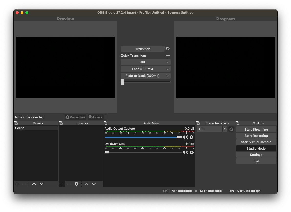
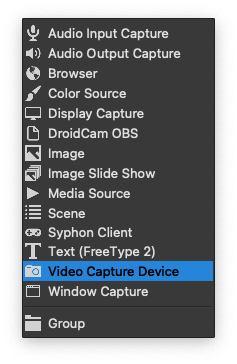
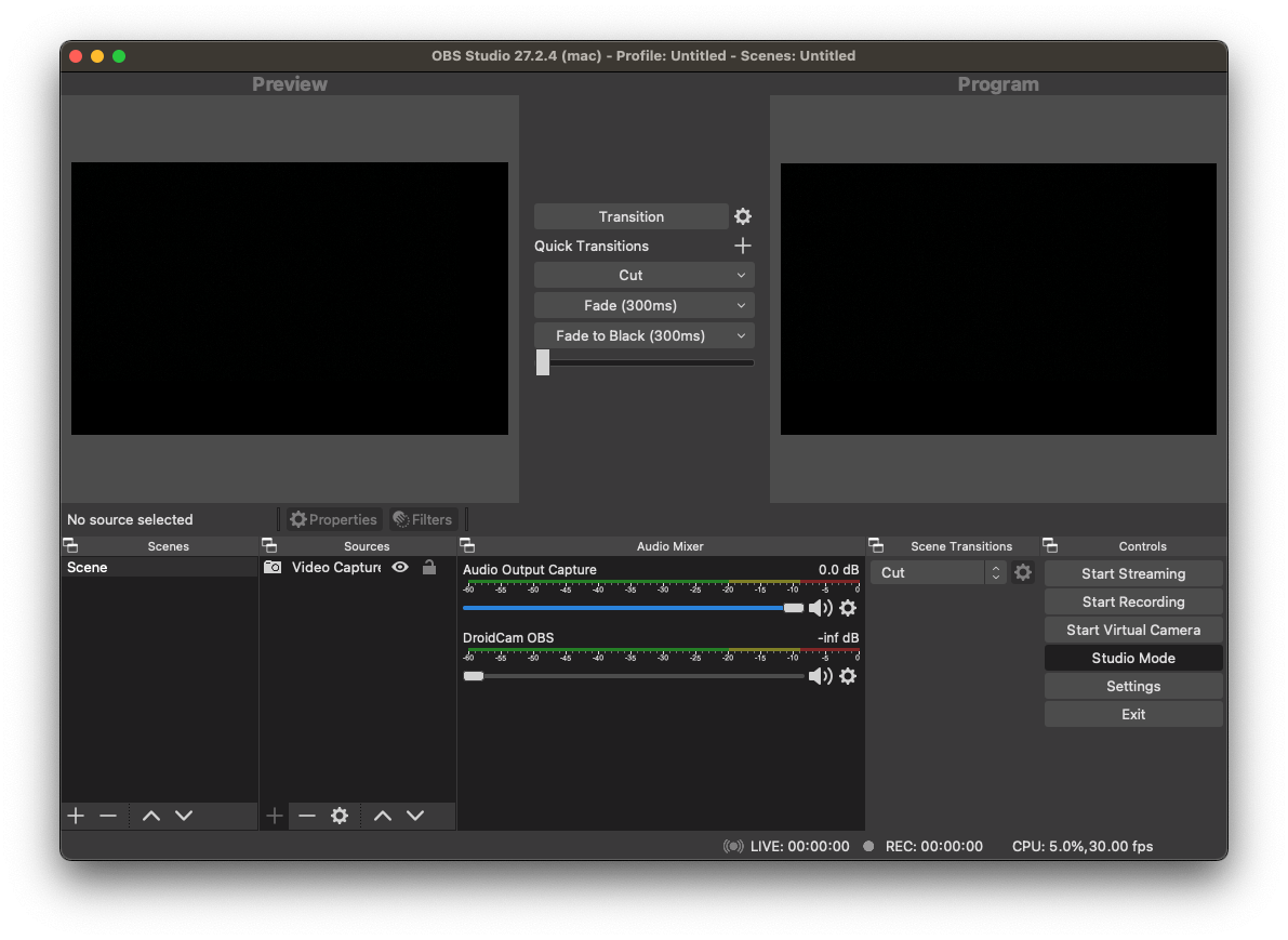
Open OBS and create source

The creator will then need to:
  1. Click the + icon under sources and select Video Capture Device if you’d like to stream using a camera or webcam. If you’d like to stream a browser window, select Window Capture.
  2. Give the device a name:
OBS1

OBS2

OBS3

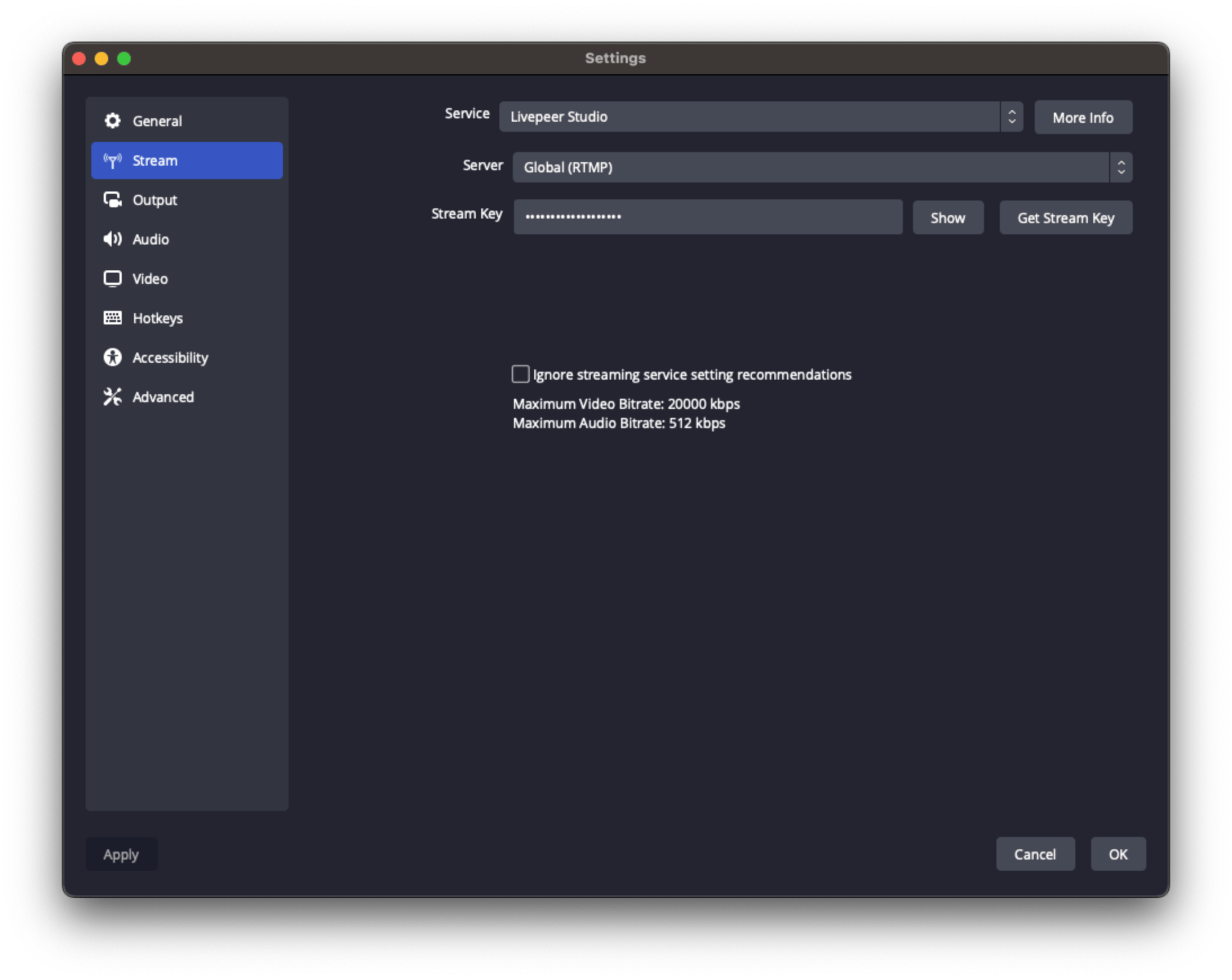
Update stream settings

  1. Select Stream settings.
  2. Select Show All… and then Livepeer Studio for the service.
  3. Keep the Default Server and paste the Stream Key provided by Livepeer Studio into the OBS “Stream Key” fields. It is highly recommended to not ignore the streaming service recommendations. If you choose to do this, please see the low latency section below.
OBS4

Stream and play back

After they save their settings, OBS will return to the stream console. Press start streaming (from the output they selected when inputting your stream settings above). Any player will now be able to play back the livestream with the playback ID.
LVS4

Configuring OBS for Low Latency

Balancing Low Latency with User Experience

Achieving the right balance between low latency and stream quality is essential for providing the best possible user experience. Two settings that significantly impact your stream quality, latency, and user experience are:
  • Rate Control: This setting dictates the bitrate or “quality” of the stream. A high amount of bandwidth usually means better quality, but keep in mind that your output can never improve the quality of your stream beyond your input.
  • Keyframe Interval: Video streams consist of full frames and data relative to the full frames. This setting determines how often a full frame appears, which heavily influences latency.

Optimizing for Low Latency

Low latency is primarily determined by the keyframe interval. Having keyframes appear more frequently allows viewers to “hook onto” a point closer to the actual live point. However, full frames can’t (re)use references to other frames, so more bandwidth is needed to generate a stream of the same quality compared to one with a lower number of keyframes.
We also require that the user turns off B-frames for lowest latency. B-frames, or bidirectional frames, are a type of video frame that makes use of references from the past as well as the future. They improve video compression by having more context, but also increase latency because they require a bigger encode buffer. Furthermore, in WebRTC video playback, B-frames will appear out-of-order on most systems.

Optimizing for Stream Quality and User Experience

Stream quality and user experience are mainly decided by the rate control of the stream. When optimizing for user experience, consider the stability of the video playback and the smoothness of the video. This is mostly decided by the peak bitrate of the video. A high peak bitrate can cause playback problems like buffering or skips in video playback for some viewers.

Livepeer-specific considerations

Since Livepeer is mostly HLS-based, a 2-second keyframe interval is generally encouraged, as HLS has a minimum latency of around 3-5 keyframe intervals. This choice would prioritize low latency. However, if the connection is fairly poor, a 5-second keyframe interval will allow for higher quality per bit at the expense of more latency. If quality is valued over latency, this is a better choice, and you could even consider going for longer intervals. It is essential to understand the impact of each setting and adapt them to your specific requirements and priorities. The optimal stream settings may vary depending on your specific requirements. The following profiles provide a good starting point for balancing low latency with stream quality and user experience. You may need to adjust the settings to suit your specific situation.

Low latency, high quality

This profile prioritizes low latency, but still maintains a good quality at the cost of more (and more unpredictably spiking) bandwidth.
Rate Control: CRF
CRF: 25
Keyframe Interval: 1
CPU Usage Preset: Very fast
Profile: High
Tune: None
x264 options: bframes=0
Resolution: 1080p

Low latency for bad connections

This profile prioritizes low latency, sacrificing quality to maintain a low bit rate so that even those with bad connections can watch reliably.
Rate Control: CBR
Bit Rate: 1200
Keyframe Interval: 1
CPU Usage Preset: Very fast
Profile: High
Tune: None
x264 options: bframes=0
Resolution: 720p

Balanced high quality

A good balance between reasonable latency and reasonable bit rate, but with consistently high quality.
Rate Control: CRF
CRF: 25
Keyframe Interval: 2
CPU Usage Preset: Very fast
Profile: High
Tune: None
No additional x264 options
Resolution: Any

Balanced for bad connections

A good balance between reasonable latency and reasonable quality, but with a consistent bit rate that should be comfortably viewable for most modern internet connections.
Rate Control: CBR
Bit Rate: 2000
Keyframe Interval: 2
CPU Usage Preset: Very fast
Profile: High
Tune: None
No additional x264 options
Resolution: Up to 1080p

High quality, high latency

This profile prioritizes quality over everything else, sacrificing latency to keep the bit rate within reasonable bounds.
Rate Control: CRF
CRF: 27
Keyframe Interval: 10
CPU Usage Preset: Very fast
Profile: High
Tune: None
x264 options: bframes=3
Resolution: 1080p

Low bandwidth, high latency

This profile prioritizes watchability, even for really bad connections, sacrificing both quality and latency to do so.
Rate Control: CBR
Bit Rate: 700
Keyframe Interval: 10
CPU Usage Preset: Very fast
Profile: High
Tune: None
x264 options: bframes=3
Resolution: 720p or lower
Last modified on March 18, 2026