. Not present in production builds. Safe no-op in prod. */ body { padding: 0 !important; } /* Colors Used #3CB540 - Jade Green #2b9a66 - Light Green #18794E - Dark Green Complementary Greens See https://coolors.co/004225-1a794e-08a045-3cb540-62ba4f #004225 - Deep Forrest #1A794E - Turf Green #08A045 - Medium Jungle #3CB540 - Jade Green #6BBF59 - Moss Green See https://coolors.co/0c0c0c-073b3a-1a794e-08a045-6bbf59 #0C0C0C - Onyx Black #073B3A - Dark Teal #1A794E - Turf Green #08A045 - Medium Jungle #6BBF59 - Moss Green See https://coolors.co/fffffa-073b3a-1a794e-08a045-6bbf59 #FFFFFA - Porcelain #073B3A - Dark Teal #1A794E - Turf Green #08A045 - Medium Jungle #6BBF59 - Moss Green Pink Offset Colour See https://coolors.co/073b3a-1a794e-f61067-08a045-6bbf59 #F61067 - Razzmatazz Pink #073B3A - Dark Teal #1A794E - Turf Green #08A045 - Medium Jungle #6BBF59 - Moss Green */ /* ============================================ GLOBAL THEME VARIABLES Component governance source of truth ============================================ */ :root { --lp-color-accent: #3cb540; --lp-color-accent-strong: #18794e; --lp-color-accent-soft: #6bbf59; --lp-color-accent-bright: #5dd662; --lp-color-accent-brightest: #a0f0a5; --lp-color-arbitrum: #3ea6f8; --lp-color-text-primary: #181c18; --lp-color-text-secondary: #717571; --lp-color-text-muted: #9ca3af; --lp-color-bg-page: #ffffff; --lp-color-bg-card: #f9fafb; --lp-color-bg-elevated: #f3f6f4; --lp-color-bg-subtle: rgba(24, 28, 24, 0.04); --lp-color-bg-overlay: rgba(12, 12, 12, 0.5); --lp-color-border-default: #e5e7eb; --lp-color-border-strong: rgba(24, 28, 24, 0.18); --lp-color-border-inverse: rgba(255, 255, 255, 0.5); --lp-color-on-accent: #ffffff; --lp-color-link: #18794e; --lp-color-link-hover: #004225; --lp-color-brand-discord: #5865f2; --lp-color-brand-forum: #00aeef; --lp-color-brand-github: #181c18; --lp-color-brand-x: #181c18; --lp-color-brand-globe: #00c0ff; --lp-color-brand-twitch: #9048ff; --lp-color-brand-youtube: #ff0034; --lp-color-brand-instagram: #dc2275; --lp-color-brand-linkedin: #0189df; --lp-color-brand-preview: #b636dd; --lp-color-brand-coming-soon: #ef1a73; --lp-color-brand-linux: #ff9a0e; --lp-color-brand-windows: #14bbf7; --lp-color-brand-macos: #60ba47; --lp-color-status-good: #22c55e; --lp-color-status-warn: #fbbf24; --lp-color-status-bad: #ef4444; --lp-spacing-1: 0.25rem; --lp-spacing-2: 0.5rem; --lp-spacing-3: 0.75rem; --lp-spacing-4: 1rem; --lp-spacing-6: 1.5rem; --lp-spacing-8: 2rem; --lp-spacing-px-3: 3px; --lp-spacing-px-4: 4px; --lp-spacing-px-6: 6px; --lp-spacing-px-8: 8px; --lp-spacing-px-12: 12px; --lp-font-sans: 'Inter', 'Segoe UI', sans-serif; --lp-font-mono: 'SFMono-Regular', 'SF Mono', 'Menlo', monospace; --lp-radius-sm: 0.25rem; --lp-radius-md: 0.5rem; --lp-radius-lg: 0.75rem; --lp-shadow-card: 0 8px 24px rgba(24, 28, 24, 0.08); --lp-z-base: 1; --lp-z-overlay: 10; --lp-z-modal: 50; /* Legacy aliases maintained during migration */ --accent: var(--lp-color-accent); --accent-dark: var(--lp-color-accent-strong); --hero-text: var(--lp-color-text-primary); --text: var(--lp-color-text-secondary); --text-secondary: var(--lp-color-text-secondary); --muted-text: var(--lp-color-text-muted); --background: var(--lp-color-bg-page); --card-background: var(--lp-color-bg-card); --background-highlight: var(--lp-color-bg-subtle); --border: var(--lp-color-border-default); --button-text: var(--lp-color-on-accent); --page-header-description-color: var(--lp-color-text-secondary); --arbitrum: var(--lp-color-arbitrum); } .dark { --lp-color-accent: #2b9a66; --lp-color-accent-strong: #18794e; --lp-color-accent-soft: #3cb540; --lp-color-accent-bright: #5dd662; --lp-color-accent-brightest: #7fe584; --lp-color-text-primary: #e0e4e0; --lp-color-text-secondary: #a0a4a0; --lp-color-text-muted: #6b7280; --lp-color-bg-page: #0d0d0d; --lp-color-bg-card: #1a1a1a; --lp-color-bg-elevated: #141a16; --lp-color-bg-subtle: rgba(255, 255, 255, 0.1); --lp-color-bg-overlay: rgba(0, 0, 0, 0.5); --lp-color-border-default: #333333; --lp-color-border-strong: rgba(255, 255, 255, 0.3); --lp-color-border-inverse: rgba(255, 255, 255, 0.5); --lp-color-on-accent: #ffffff; --lp-color-link: #5dd662; --lp-color-link-hover: #a0f0a5; --lp-color-brand-github: #f0f0f0; /* Legacy aliases maintained during migration */ --accent: var(--lp-color-accent); --accent-dark: var(--lp-color-accent-strong); --hero-text: var(--lp-color-text-primary); --text: var(--lp-color-text-secondary); --text-secondary: var(--lp-color-text-secondary); --muted-text: var(--lp-color-text-muted); --background: var(--lp-color-bg-page); --card-background: var(--lp-color-bg-card); --background-highlight: var(--lp-color-bg-subtle); --border: var(--lp-color-border-default); --button-text: var(--lp-color-on-accent); --page-header-description-color: var(--lp-color-text-secondary); --arbitrum: var(--lp-color-arbitrum); } /* ============================================ */ /* Code block themes hiki codeblock themes: Popular Dark Themes: github-dark (what you have now) github-dark-dimmed github-dark-high-contrast dracula dracula-soft monokai nord one-dark-pro poimandres rose-pine everforest-dark vitesse-dark Popular Light Themes: github-light (what you have now) github-light-high-contrast solarized-light rose-pine-dawn everforest-light vitesse-light */ /* img[alt="dark logo"], img[alt="light logo"] { max-width: 180px; } */ /* V2 TEST */ /* a.nav-tabs-item[href="/pages/resources/resources_hub.mdx"], a.nav-tabs-item[href="/pages/08_help/README"] { color: rgba(255, 90, 90, 0.342) !important; } */ /* Make the nav-tabs container full width */ .nav-tabs { width: 100%; justify-content: flex-start; } /* Fix Mintlify content width and centering. Regular pages: balance padding + widen inner cap. Portal/frame pages: balance padding (smaller) + widen inner cap for full-width hero. */ @media (min-width: 1024px) { /* Regular pages */ #content-container:not(:has(.frame-mode-hero-full)):not( :has(.frame-mode-container) ) { padding-left: 3rem !important; padding-right: 3rem !important; } #content-container:not(:has(.frame-mode-hero-full)):not( :has(.frame-mode-container) ) > .max-w-5xl { max-width: 72rem !important; } /* Portal/frame pages — tighter balanced padding, wider inner cap */ #content-container:has(.frame-mode-hero-full), #content-container:has(.frame-mode-container) { padding-left: 2rem !important; padding-right: 2rem !important; } #content-container:has(.frame-mode-hero-full) > .max-w-5xl, #content-container:has(.frame-mode-container) > .max-w-5xl { max-width: 80rem !important; } } #navbar > div.z-10.mx-auto.relative > div.hidden.lg\:flex.px-12.h-12 > div { column-gap: 2rem !important; } a.nav-tabs-item[href*='/internal/'] { margin-left: 1rem; margin-right: -1rem; padding-right: 0; border-bottom-color: transparent !important; } /* .gap-x-6 { column-gap: 2rem !important; } */ /* .nav-tabs h-full flex text-sm gap-x-6 { column-gap: 2rem !important; } */ /* Push Resource HUB to the right and style as outlined button */ a.nav-tabs-item[href$='/resources/redirect'], a.nav-tabs-item[href$='/resources/portal'], a.nav-tabs-item[href$='/07_resources/redirect'], a.nav-tabs-item[href$='/07_resources/portal'] { margin-left: auto; background-color: transparent; border: 1px solid var(--accent) !important; padding: 4px 8px; border-radius: 4px; font-size: 0.7rem; height: auto !important; align-self: center; margin-right: -2rem; } /* Color the text */ /* a.nav-tabs-item[href="/v2/resources/resources_hub"] { color: #2b9a66 !important; } */ /* Shrink & color the icon */ a.nav-tabs-item[href$='/resources/redirect'] svg, a.nav-tabs-item[href$='/resources/portal'] svg, a.nav-tabs-item[href$='/07_resources/redirect'] svg, a.nav-tabs-item[href$='/07_resources/portal'] svg, a.nav-tabs-item[href$='/07_resources/resources_hub'] svg { height: 0.75rem; width: 0.75rem; /* background-color: #2b9a66 !important; */ } /* Hide the underline on the button */ a.nav-tabs-item[href$='/resources/redirect'] > div:last-child, a.nav-tabs-item[href$='/resources/portal'] > div:last-child, a.nav-tabs-item[href$='/07_resources/redirect'] > div:last-child, a.nav-tabs-item[href$='/07_resources/portal'] > div:last-child, a.nav-tabs-item[href$='/07_resources/resources_hub'] > div:last-child { display: none; } /* Stack footer links vertically */ #footer .flex-col .flex.gap-4 { flex-direction: column !important; gap: 0rem !important; } /* Reduce footer padding */ #footer > div { padding-top: 2rem !important; padding-bottom: 1rem !important; } /* Accessibility: prevent hidden assistant sheet from receiving focus */ #chat-assistant-sheet[aria-hidden='true'] { display: none !important; } /* Accessibility: ensure CTA buttons meet minimum target size */ button.text-left.text-gray-600.text-sm.font-medium { min-height: 24px; padding-top: 4px; padding-bottom: 4px; } /* #footer > div > div:first-child { display: flex; flex-direction: row !important; color: red !important; } #footer > div > div:first-child > div { display: flex; flex-direction: row !important; color: green !important; } */ /* Fix bad styling of cards with arrows */ [data-component-part='card-content-container'] { padding-right: 2.5rem; /* Creates space for the arrow */ } /* Reposition View component dropdown */ /* To find the correct selector: 1. Open your page with View components in the browser 2. Right-click on the dropdown in the top-right corner 3. Select "Inspect Element" 4. Find the class name or data attribute 5. Replace the selector below with the actual one */ /* Common possible selectors - uncomment and adjust the one that works */ /* Option 1: If it has a data attribute */ /* [data-view-dropdown] { position: relative !important; top: 60px !important; right: 20px !important; } */ /* Option 2: If it's in a fixed container */ /* .fixed [class*="view"] { position: relative !important; top: 60px !important; } */ /* Option 3: Target by position (fixed elements in top-right) */ /* .fixed.top-0.right-0 [class*="select"], .fixed.top-0.right-0 [class*="dropdown"] { position: relative !important; top: 60px !important; margin-right: 20px !important; } */ /* Option 4: Move it inline with content instead of fixed position */ /* Replace 'ACTUAL_SELECTOR' with the real class name from browser inspection */ /* ACTUAL_SELECTOR { position: static !important; display: inline-block !important; margin-bottom: 20px !important; } */ .code-block > div > div > svg { background-color: #18794e !important; } /* Error 404 Styling */ #error-description > span > div > div { border: 1px solid #18794e !important; } body > div.relative.antialiased.text-gray-500.dark\:text-gray-400 > div.peer-\[\.is-not-custom\]\:lg\:flex.peer-\[\.is-custom\]\:\[\&\>div\:first-child\]\:\!hidden.peer-\[\.is-custom\]\:\[\&\>div\:first-child\]\:sm\:\!hidden.peer-\[\.is-custom\]\:\[\&\>div\:first-child\]\:md\:\!hidden.peer-\[\.is-custom\]\:\[\&\>div\:first-child\]\:lg\:\!hidden.peer-\[\.is-custom\]\:\[\&\>div\:first-child\]\:xl\:\!hidden > div.flex.flex-col.items-center.justify-center.w-full.max-w-lg.overflow-x-hidden.mx-auto.py-48.px-5.text-center.\*\:text-center.gap-y-8.not-found-container > div { margin-top: -5rem; } #error-description > span > div > div > div.relative.rounded-xl.overflow-hidden.flex.justify-center > img { width: 500px; aspect-ratio: 4 / 3; object-fit: cover; /* border: 1px solid #fff; */ } /* Step List Color Icons Styling */ /* #content > div.steps > div > div.absolute.ml-\[-13px\].py-2 > div { background-color: #18794e !important; } */ /* Step List Color Titles */ #content > div.steps.ml-3\.5.mt-10.mb-6 > div > div.w-full.overflow-hidden.pl-8.pr-px > p { color: #2b9a66 !important; } /* View Dropdown */ /* #radix-_R_5slubt9fen9fdb_ */ /* Turn off bg-white in dark mode for multi-view dropdown (PALM THEME BUG) */ .dark .bg-white\/\[0\.95\].multi-view-dropdown-trigger { background-color: transparent !important; background: none !important; } /* Sidebar collapse button - bigger and easier to click */ /* #sidebar button.absolute { min-width: 2.5rem !important; min-height: 2.5rem !important; padding: 0.75rem !important; z-index: 100 !important; } */ /* Override US flag with UK flag in language selector */ /* Hide the original img and use background-image instead */ /* #localization-select-trigger img[alt="US"], #localization-select-item-en img[alt="US"], img[alt="US"][src*="flags/US.svg"] { opacity: 0 !important; position: relative !important; } #localization-select-trigger img[alt="US"]::before, #localization-select-item-en img[alt="US"]::before, img[alt="US"][src*="flags/US.svg"]::before { content: "" !important; position: absolute !important; top: 0 !important; left: 0 !important; width: 100% !important; height: 100% !important; background-image: url("/snippets/assets/media/images/site/united-kingdom-flag-icon.svg") !important; background-size: cover !important; background-position: center !important; border-radius: 50% !important; opacity: 1 !important; } */ /* Hide the panel on frame mode pages (MINTLIFY SUCKS) */ /* Hide empty table of contents layout only when it's empty */ #table-of-contents-layout:empty, #content-side-layout:has(#table-of-contents-layout:empty) { display: none; } /* DynamicTable: force fixed layout so columnWidths prop values take effect. Mintlify's Tailwind prose resets table-layout to auto — !important required. */ [data-docs-dynamic-table] { table-layout: fixed !important; } /* StyledTable should sit flush inside its own border shell. Mint wraps rendered tables in a scroll container with vertical padding, which creates a false gap above/below the header row. */ [data-docs-styled-table-shell] > div { padding-top: 0 !important; padding-bottom: 0 !important; margin-top: 0 !important; margin-bottom: 0 !important; } /* BorderedBox should own its internal spacing. Trim default block margins on the first/last rendered child so headings and paragraphs do not add a false gap inside the padded shell. */ [data-docs-bordered-box] > :first-child { margin-top: 0 !important; } [data-docs-bordered-box] > :last-child { margin-bottom: 0 !important; } [data-docs-bordered-box][data-accent-bar]::before { content: ""; position: absolute; top: 0; bottom: 0; left: 0; width: 4px; background-color: var(--accent-bar-color); border-radius: inherit; border-top-right-radius: 0; border-bottom-right-radius: 0; } /* Frame mode container - 80% of #content-container width, centered */ /* Breaks out of #content padding to center in full #content-container */ .frame-mode-container { width: calc(100% + 96px + 20px); /* 976px */ margin-left: -96px; margin-right: -20px; margin-bottom: 2rem; padding-left: 15%; /* Adjust this for desired content width */ padding-right: 15%; /* Adjust this for desired content width */ box-sizing: border-box; } /* Frame mode container inside hero - already broken out, so reset */ .frame-mode-hero-full .frame-mode-container { width: 100%; margin-left: 0; margin-right: 0; padding-left: 0%; padding-right: 0%; } /* Pagination on frame mode pages ONLY - match container padding */ [data-page-mode='frame'] #pagination { width: calc(100% + 96px + 20px); margin-left: -96px; margin-right: -20px; padding-left: calc((100% + 96px + 20px) * 0.1 + 96px); padding-right: calc((100% + 96px + 20px) * 0.1 + 20px); box-sizing: border-box; } /* Hero full width - breaks out of #content padding to fill #content-container */ .frame-mode-hero-full { width: calc(100% + 96px + 20px); margin-left: -96px; margin-right: -20px; position: relative; } @media (max-width: 1023px) { .frame-mode-container { width: 100%; margin-left: 0; margin-right: 0; padding-left: 1rem; padding-right: 1rem; } [data-page-mode='frame'] #pagination { width: 100%; margin-left: 0; margin-right: 0; padding-left: 1rem; padding-right: 1rem; } .frame-mode-hero-full { width: 100%; margin-left: 0; margin-right: 0; } } #starfield { position: absolute; inset: 0; width: 100%; height: 100%; pointer-events: none; z-index: 0; } /* Target the card content container */ .frame-mode-hero-full [data-component-part='card-content-container'] { padding-top: 0.5rem; padding-bottom: 0.5rem; padding-left: 1rem; padding-right: 2.5rem; /* Space for arrow icon (0.75rem right + icon width ~1rem + margin) */ } /* Target the arrow icon */ .frame-mode-hero-full #card-link-arrow-icon { top: 0.75rem; right: 0.75rem; } /* #content > div.frame-mode-hero-full > div.frame-mode-container > div > div:nth-child(2) > div > div > div:nth-child(4) > a > div { padding-top: 0.5rem; padding-bottom: 0.5rem; } #content > div.frame-mode-hero-full > div.frame-mode-container > div > div:nth-child(2) > div > div > div:nth-child(4) > a > div > #card-link-arrow-icon { top: 0.75rem; right: 0.75rem; } */ /* ============================================ ACCESSIBILITY — Focus indicators ============================================ */ input:focus-visible, select:focus-visible, textarea:focus-visible, button:focus-visible, a:focus-visible, [tabindex]:focus-visible { outline: 2px solid var(--accent) !important; outline-offset: 2px; } /* ============================================ ACCESSIBILITY — Responsive breakpoints ============================================ */ @media (max-width: 767px) { .frame-mode-hero-full { width: 100%; max-width: 100%; overflow-x: hidden; } } @media (max-width: 480px) { #content { padding-left: 1rem; padding-right: 1rem; } } /* ============================================ UTILITY CLASSES — inline element styling Used where components can't replace inline spans (e.g., inside Mintlify , components) ============================================ */ .lp-inline-flex { display: flex; align-items: center; } .lp-text-muted { color: var(--lp-color-text-secondary); } .lp-text-italic-muted { font-style: italic; color: var(--lp-color-text-secondary); } .lp-inline-flex-gap { display: flex; align-items: center; gap: 0.2rem; } .lp-link-underline { border-bottom: 1.5px solid var(--lp-color-text-primary); color: var(--lp-color-text-primary); padding-bottom: 0.25rem; }
Livepeer offers detailed information on viewer behavior and playback quality on your platform. The API includes engagement metrics such as view counts and watch time, as well as performance metrics such as error rate, time to first frame, rebuffer ratio, and exit-before-starts across a variety of dimensions.

Realtime Viewership

Please note that in order to use Realtime Viewership metrics, you need to use Player SDK @livepeer/react version 4.2.0 or higher.
This API includes real-time metrics about the ongoing livestream or VOD engagement:
  • Viewer Count: The number of viewers currently watching the stream (or VOD).
  • Error Rate: This metric helps to understand the number of errors that viewers are experiencing while watching the stream (or VOD).

Usage Metrics

This API includes usage metrics to help you understand how viewers are engaging with your platform:
  • Number of Views: This metric gives you a comprehensive view of the total number of views across your platform. We colloquially define a view as “play intent”, which means the video either played, stalled, or encountered an error.
  • Minutes of Watch Time: Measure the total amount of time viewers spend on your platform, so you can track engagement and identify areas for improvement.
Please note that data is refreshed every 5 minutes and newly uploaded videos may take up to an hour before viewership data is available

Performance Metrics

This API offers several key performance metrics to help you understand your platforms performance:
  • Error Rate: Percentage of views that encountered an error.
  • Time to First Frame (TTFF): Measures the time in milliseconds it takes between the player requesting video and the first frame being ready to play.
  • Rebuffer Ratio: Percentage of time a viewer spends experiencing rebuffering during playback.
  • Exit Before Starts: Percentage of views that are abandoned before the video begins to play, potentially indicating issues with playback.
Please note that data is refreshed every 5 minutes and newly uploaded videos may take up to an hour before viewership data is available

Dimensions

To provide a comprehensive view of viewer behavior, our data product includes several dimensions to help you segment your data and identify patterns:
  • Video: View metrics for individual videos, queryable by playback ID or by dStorage ID’s, such as CID.
  • Browser: Understand how different browsers impact viewer behavior and performance, so you can optimize your platform for each browser type.
  • Device: Understand how different devices impact viewer behavior, so you can optimize your platform for each device type.
  • OS: Understand how different operating systems impact viewer behavior, so you can optimize your platform for each OS.
  • Continent, Country, and Subdivisions: Segment your data by location to identify regional trends and tailor your platform to local preferences.
  • Time Zone: Measure viewer behavior across different time zones, so you can optimize your platform for peak usage times.
  • Time: Analyze viewer behavior across different time periods (hour, day, week, month, year, all-time) to identify trends.

Registering views

To collect and register viewership metrics, you first need to configure your player. We recommend that you use the Livepeer player to get viewership metrics, as it comes fully configured. You can follow the Player guide to get started.

Retrieving views from the Dashboard

The Livepeer Studio Dashboard is a frontend interface for publishing live or on-demand video streams with no code. In this guide, we’ll show you how to use the dashboard to retrieve viewership metrics.
Assets page

Click on an existing asset

Click on an existing asset and you’ll be brought to that asset’s specific details page. If you haven’t created an asset yet, you can follow the upload a video asset guide.
Assets page

View your asset’s viewership metrics

In the asset’s specific detail page you can view its total number of views.
Asset views

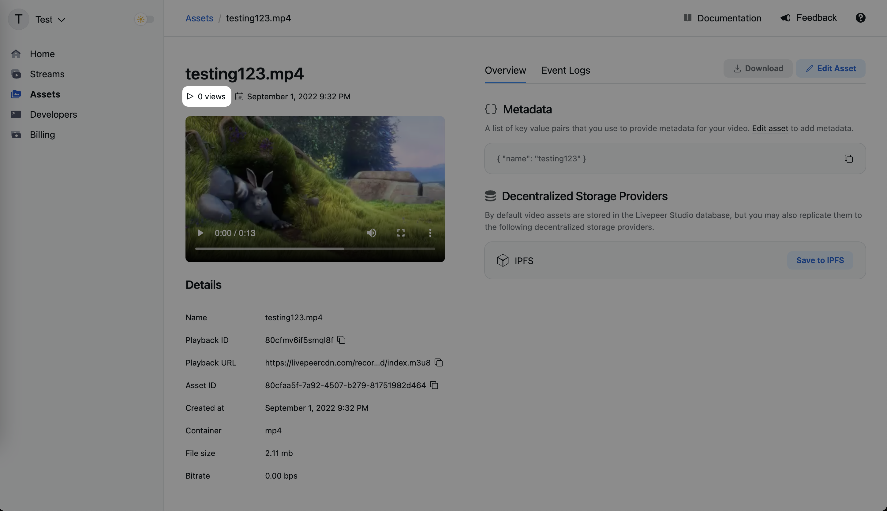
Retrieving views from the API

Get the playbackId of an existing stream/asset

Get the playbackId of an existing asset. A playbackId can be found in the stream/asset page on the dashboard or from any Asset API call. If you haven’t created a stream/asset yet, you can follow the upload a video asset guide.
The playbackId can be a canonical playback ID from a specific Livepeer asset or stream objects, or dStorage identifiers for assets. Queries by dStorage ID are universal/cross-account, as explained below, so check what makes the most sense for your app.
When querying by dStorage ID (e.g. ipfs:// or ar:// URLs, or CID/txID), you will get views for all assets with that dStorage ID across any Livepeer account. This is useful to display global metrics from a video. To display the viewership metrics only from the videos in your account, use the API objects playbackId.

Retrieve viewership data

Once you have the playbackId, you can make a request to get the viewership data.
curl --request GET \
  --url https://livepeer.studio/api/data/views/query/total/{playbackId} \
  --header 'Authorization: Bearer <token>'
For more information on the API and SDK methods, refer to the API reference.

Diving deeper

If you’re happy with the above metrics you can stop here. If you want to build more advanced analytics, you can use the following API endpoints to get more detailed data.

Realtime Viewership API

This API can be called from the frontend to retrieve realtime engagement metrics (current view count and error rate). You can break down the results by playback id, browser, device, and country.
curl --request GET \
  --url 'https://livepeer.studio/api/data/views/now?playbackId=playback_id&breakdownBy%5B%5D=browser' \
  --header 'Authorization Bearer <token>'
For more information on the API and SDK methods, refer to the API reference.

Creator metrics API

This API can be called from the frontend to retrieve detailed engagement metrics for a specific resource. The only restriction it has is that it has to be called with an assetId or streamId values, which are private values today that only the asset creator should have access. Soon this creator ownership will be validated using wallet signatures instead. The idea for this API is to build creator analytics dashboards. It can be called from the frontend and can provide detailed insights to creators about their assets and streams.
curl --request GET \
  --url 'https://livepeer.studio/api/data/views/query/creator?from=from&to=to&timeStep=day&assetId=asset_id_here&breakdownBy%5B%5D=browser' \
  --header 'Authorization: Bearer <token>'

For more information on the API and SDK methods, refer to the API reference.

All metrics API

This API can be called from the backend to retrieve detailed engagement metrics for a specific resource. It requires a non-CORS API key to be used, meaning that it cannot be called from the frontend. This is for security reasons since this API provides full access to all metrics in the account, meaning it provides the most flexibility in queries. The idea is that developers should build their own abstraction and access control logics on top of this API and abstract it as higher level API in their apps.
curl --request GET \
  --url 'https://livepeer.studio/api/data/usage/query?timeStep=hour&breakdownBy%5B%5D=creatorId&from=from&to=to' \
  --header 'Authorization: Bearer <token>'
For more information on the API and SDK methods, refer to the API reference.

Visualizing Your Data

If you are ready to take a deep dive into your data, then visualizations are the next step. We have put together a tutorial complete with templates to get you started.

Visualize Engagement Metrics with Grafana

If you are interested in visualizing your engagement metrics with Grafana, feel free to check out our tutorial, Visualize Engagement Metrics with Grafana, to learn more.
Last modified on March 8, 2026