. Not present in production builds. Safe no-op in prod. */ body { padding: 0 !important; } /* Colors Used #3CB540 - Jade Green #2b9a66 - Light Green #18794E - Dark Green Complementary Greens See https://coolors.co/004225-1a794e-08a045-3cb540-62ba4f #004225 - Deep Forrest #1A794E - Turf Green #08A045 - Medium Jungle #3CB540 - Jade Green #6BBF59 - Moss Green See https://coolors.co/0c0c0c-073b3a-1a794e-08a045-6bbf59 #0C0C0C - Onyx Black #073B3A - Dark Teal #1A794E - Turf Green #08A045 - Medium Jungle #6BBF59 - Moss Green See https://coolors.co/fffffa-073b3a-1a794e-08a045-6bbf59 #FFFFFA - Porcelain #073B3A - Dark Teal #1A794E - Turf Green #08A045 - Medium Jungle #6BBF59 - Moss Green Pink Offset Colour See https://coolors.co/073b3a-1a794e-f61067-08a045-6bbf59 #F61067 - Razzmatazz Pink #073B3A - Dark Teal #1A794E - Turf Green #08A045 - Medium Jungle #6BBF59 - Moss Green */ /* ============================================ GLOBAL THEME VARIABLES Component governance source of truth ============================================ */ :root { --lp-color-accent: #3cb540; --lp-color-accent-strong: #18794e; --lp-color-accent-soft: #6bbf59; --lp-color-accent-bright: #5dd662; --lp-color-accent-brightest: #a0f0a5; --lp-color-arbitrum: #3ea6f8; --lp-color-text-primary: #181c18; --lp-color-text-secondary: #717571; --lp-color-text-muted: #9ca3af; --lp-color-bg-page: #ffffff; --lp-color-bg-card: #f9fafb; --lp-color-bg-elevated: #f3f6f4; --lp-color-bg-subtle: rgba(24, 28, 24, 0.04); --lp-color-bg-overlay: rgba(12, 12, 12, 0.5); --lp-color-border-default: #e5e7eb; --lp-color-border-strong: rgba(24, 28, 24, 0.18); --lp-color-border-inverse: rgba(255, 255, 255, 0.5); --lp-color-on-accent: #ffffff; --lp-color-link: #18794e; --lp-color-link-hover: #004225; --lp-color-brand-discord: #5865f2; --lp-color-brand-forum: #00aeef; --lp-color-brand-github: #181c18; --lp-color-brand-x: #181c18; --lp-color-brand-globe: #00c0ff; --lp-color-brand-twitch: #9048ff; --lp-color-brand-youtube: #ff0034; --lp-color-brand-instagram: #dc2275; --lp-color-brand-linkedin: #0189df; --lp-color-brand-preview: #b636dd; --lp-color-brand-coming-soon: #ef1a73; --lp-color-brand-linux: #ff9a0e; --lp-color-brand-windows: #14bbf7; --lp-color-brand-macos: #60ba47; --lp-color-status-good: #22c55e; --lp-color-status-warn: #fbbf24; --lp-color-status-bad: #ef4444; --lp-spacing-1: 0.25rem; --lp-spacing-2: 0.5rem; --lp-spacing-3: 0.75rem; --lp-spacing-4: 1rem; --lp-spacing-6: 1.5rem; --lp-spacing-8: 2rem; --lp-spacing-px-3: 3px; --lp-spacing-px-4: 4px; --lp-spacing-px-6: 6px; --lp-spacing-px-8: 8px; --lp-spacing-px-12: 12px; --lp-font-sans: 'Inter', 'Segoe UI', sans-serif; --lp-font-mono: 'SFMono-Regular', 'SF Mono', 'Menlo', monospace; --lp-radius-sm: 0.25rem; --lp-radius-md: 0.5rem; --lp-radius-lg: 0.75rem; --lp-shadow-card: 0 8px 24px rgba(24, 28, 24, 0.08); --lp-z-base: 1; --lp-z-overlay: 10; --lp-z-modal: 50; /* Legacy aliases maintained during migration */ --accent: var(--lp-color-accent); --accent-dark: var(--lp-color-accent-strong); --hero-text: var(--lp-color-text-primary); --text: var(--lp-color-text-secondary); --text-secondary: var(--lp-color-text-secondary); --muted-text: var(--lp-color-text-muted); --background: var(--lp-color-bg-page); --card-background: var(--lp-color-bg-card); --background-highlight: var(--lp-color-bg-subtle); --border: var(--lp-color-border-default); --button-text: var(--lp-color-on-accent); --page-header-description-color: var(--lp-color-text-secondary); --arbitrum: var(--lp-color-arbitrum); } .dark { --lp-color-accent: #2b9a66; --lp-color-accent-strong: #18794e; --lp-color-accent-soft: #3cb540; --lp-color-accent-bright: #5dd662; --lp-color-accent-brightest: #7fe584; --lp-color-text-primary: #e0e4e0; --lp-color-text-secondary: #a0a4a0; --lp-color-text-muted: #6b7280; --lp-color-bg-page: #0d0d0d; --lp-color-bg-card: #1a1a1a; --lp-color-bg-elevated: #141a16; --lp-color-bg-subtle: rgba(255, 255, 255, 0.1); --lp-color-bg-overlay: rgba(0, 0, 0, 0.5); --lp-color-border-default: #333333; --lp-color-border-strong: rgba(255, 255, 255, 0.3); --lp-color-border-inverse: rgba(255, 255, 255, 0.5); --lp-color-on-accent: #ffffff; --lp-color-link: #5dd662; --lp-color-link-hover: #a0f0a5; --lp-color-brand-github: #f0f0f0; /* Legacy aliases maintained during migration */ --accent: var(--lp-color-accent); --accent-dark: var(--lp-color-accent-strong); --hero-text: var(--lp-color-text-primary); --text: var(--lp-color-text-secondary); --text-secondary: var(--lp-color-text-secondary); --muted-text: var(--lp-color-text-muted); --background: var(--lp-color-bg-page); --card-background: var(--lp-color-bg-card); --background-highlight: var(--lp-color-bg-subtle); --border: var(--lp-color-border-default); --button-text: var(--lp-color-on-accent); --page-header-description-color: var(--lp-color-text-secondary); --arbitrum: var(--lp-color-arbitrum); } /* ============================================ */ /* Code block themes hiki codeblock themes: Popular Dark Themes: github-dark (what you have now) github-dark-dimmed github-dark-high-contrast dracula dracula-soft monokai nord one-dark-pro poimandres rose-pine everforest-dark vitesse-dark Popular Light Themes: github-light (what you have now) github-light-high-contrast solarized-light rose-pine-dawn everforest-light vitesse-light */ /* img[alt="dark logo"], img[alt="light logo"] { max-width: 180px; } */ /* V2 TEST */ /* a.nav-tabs-item[href="/pages/resources/resources_hub.mdx"], a.nav-tabs-item[href="/pages/08_help/README"] { color: rgba(255, 90, 90, 0.342) !important; } */ /* Make the nav-tabs container full width */ .nav-tabs { width: 100%; justify-content: flex-start; } /* Fix Mintlify content width and centering. Regular pages: balance padding + widen inner cap. Portal/frame pages: balance padding (smaller) + widen inner cap for full-width hero. */ @media (min-width: 1024px) { /* Regular pages */ #content-container:not(:has(.frame-mode-hero-full)):not( :has(.frame-mode-container) ) { padding-left: 3rem !important; padding-right: 3rem !important; } #content-container:not(:has(.frame-mode-hero-full)):not( :has(.frame-mode-container) ) > .max-w-5xl { max-width: 72rem !important; } /* Portal/frame pages — tighter balanced padding, wider inner cap */ #content-container:has(.frame-mode-hero-full), #content-container:has(.frame-mode-container) { padding-left: 2rem !important; padding-right: 2rem !important; } #content-container:has(.frame-mode-hero-full) > .max-w-5xl, #content-container:has(.frame-mode-container) > .max-w-5xl { max-width: 80rem !important; } } #navbar > div.z-10.mx-auto.relative > div.hidden.lg\:flex.px-12.h-12 > div { column-gap: 2rem !important; } a.nav-tabs-item[href*='/internal/'] { margin-left: 1rem; margin-right: -1rem; padding-right: 0; border-bottom-color: transparent !important; } /* .gap-x-6 { column-gap: 2rem !important; } */ /* .nav-tabs h-full flex text-sm gap-x-6 { column-gap: 2rem !important; } */ /* Push Resource HUB to the right and style as outlined button */ a.nav-tabs-item[href$='/resources/redirect'], a.nav-tabs-item[href$='/resources/portal'], a.nav-tabs-item[href$='/07_resources/redirect'], a.nav-tabs-item[href$='/07_resources/portal'] { margin-left: auto; background-color: transparent; border: 1px solid var(--accent) !important; padding: 4px 8px; border-radius: 4px; font-size: 0.7rem; height: auto !important; align-self: center; margin-right: -2rem; } /* Color the text */ /* a.nav-tabs-item[href="/v2/resources/resources_hub"] { color: #2b9a66 !important; } */ /* Shrink & color the icon */ a.nav-tabs-item[href$='/resources/redirect'] svg, a.nav-tabs-item[href$='/resources/portal'] svg, a.nav-tabs-item[href$='/07_resources/redirect'] svg, a.nav-tabs-item[href$='/07_resources/portal'] svg, a.nav-tabs-item[href$='/07_resources/resources_hub'] svg { height: 0.75rem; width: 0.75rem; /* background-color: #2b9a66 !important; */ } /* Hide the underline on the button */ a.nav-tabs-item[href$='/resources/redirect'] > div:last-child, a.nav-tabs-item[href$='/resources/portal'] > div:last-child, a.nav-tabs-item[href$='/07_resources/redirect'] > div:last-child, a.nav-tabs-item[href$='/07_resources/portal'] > div:last-child, a.nav-tabs-item[href$='/07_resources/resources_hub'] > div:last-child { display: none; } /* Stack footer links vertically */ #footer .flex-col .flex.gap-4 { flex-direction: column !important; gap: 0rem !important; } /* Reduce footer padding */ #footer > div { padding-top: 2rem !important; padding-bottom: 1rem !important; } /* Accessibility: prevent hidden assistant sheet from receiving focus */ #chat-assistant-sheet[aria-hidden='true'] { display: none !important; } /* Accessibility: ensure CTA buttons meet minimum target size */ button.text-left.text-gray-600.text-sm.font-medium { min-height: 24px; padding-top: 4px; padding-bottom: 4px; } /* #footer > div > div:first-child { display: flex; flex-direction: row !important; color: red !important; } #footer > div > div:first-child > div { display: flex; flex-direction: row !important; color: green !important; } */ /* Fix bad styling of cards with arrows */ [data-component-part='card-content-container'] { padding-right: 2.5rem; /* Creates space for the arrow */ } /* Reposition View component dropdown */ /* To find the correct selector: 1. Open your page with View components in the browser 2. Right-click on the dropdown in the top-right corner 3. Select "Inspect Element" 4. Find the class name or data attribute 5. Replace the selector below with the actual one */ /* Common possible selectors - uncomment and adjust the one that works */ /* Option 1: If it has a data attribute */ /* [data-view-dropdown] { position: relative !important; top: 60px !important; right: 20px !important; } */ /* Option 2: If it's in a fixed container */ /* .fixed [class*="view"] { position: relative !important; top: 60px !important; } */ /* Option 3: Target by position (fixed elements in top-right) */ /* .fixed.top-0.right-0 [class*="select"], .fixed.top-0.right-0 [class*="dropdown"] { position: relative !important; top: 60px !important; margin-right: 20px !important; } */ /* Option 4: Move it inline with content instead of fixed position */ /* Replace 'ACTUAL_SELECTOR' with the real class name from browser inspection */ /* ACTUAL_SELECTOR { position: static !important; display: inline-block !important; margin-bottom: 20px !important; } */ .code-block > div > div > svg { background-color: #18794e !important; } /* Error 404 Styling */ #error-description > span > div > div { border: 1px solid #18794e !important; } body > div.relative.antialiased.text-gray-500.dark\:text-gray-400 > div.peer-\[\.is-not-custom\]\:lg\:flex.peer-\[\.is-custom\]\:\[\&\>div\:first-child\]\:\!hidden.peer-\[\.is-custom\]\:\[\&\>div\:first-child\]\:sm\:\!hidden.peer-\[\.is-custom\]\:\[\&\>div\:first-child\]\:md\:\!hidden.peer-\[\.is-custom\]\:\[\&\>div\:first-child\]\:lg\:\!hidden.peer-\[\.is-custom\]\:\[\&\>div\:first-child\]\:xl\:\!hidden > div.flex.flex-col.items-center.justify-center.w-full.max-w-lg.overflow-x-hidden.mx-auto.py-48.px-5.text-center.\*\:text-center.gap-y-8.not-found-container > div { margin-top: -5rem; } #error-description > span > div > div > div.relative.rounded-xl.overflow-hidden.flex.justify-center > img { width: 500px; aspect-ratio: 4 / 3; object-fit: cover; /* border: 1px solid #fff; */ } /* Step List Color Icons Styling */ /* #content > div.steps > div > div.absolute.ml-\[-13px\].py-2 > div { background-color: #18794e !important; } */ /* Step List Color Titles */ #content > div.steps.ml-3\.5.mt-10.mb-6 > div > div.w-full.overflow-hidden.pl-8.pr-px > p { color: #2b9a66 !important; } /* View Dropdown */ /* #radix-_R_5slubt9fen9fdb_ */ /* Turn off bg-white in dark mode for multi-view dropdown (PALM THEME BUG) */ .dark .bg-white\/\[0\.95\].multi-view-dropdown-trigger { background-color: transparent !important; background: none !important; } /* Sidebar collapse button - bigger and easier to click */ /* #sidebar button.absolute { min-width: 2.5rem !important; min-height: 2.5rem !important; padding: 0.75rem !important; z-index: 100 !important; } */ /* Override US flag with UK flag in language selector */ /* Hide the original img and use background-image instead */ /* #localization-select-trigger img[alt="US"], #localization-select-item-en img[alt="US"], img[alt="US"][src*="flags/US.svg"] { opacity: 0 !important; position: relative !important; } #localization-select-trigger img[alt="US"]::before, #localization-select-item-en img[alt="US"]::before, img[alt="US"][src*="flags/US.svg"]::before { content: "" !important; position: absolute !important; top: 0 !important; left: 0 !important; width: 100% !important; height: 100% !important; background-image: url("/snippets/assets/media/images/site/united-kingdom-flag-icon.svg") !important; background-size: cover !important; background-position: center !important; border-radius: 50% !important; opacity: 1 !important; } */ /* Hide the panel on frame mode pages (MINTLIFY SUCKS) */ /* Hide empty table of contents layout only when it's empty */ #table-of-contents-layout:empty, #content-side-layout:has(#table-of-contents-layout:empty) { display: none; } /* DynamicTable: force fixed layout so columnWidths prop values take effect. Mintlify's Tailwind prose resets table-layout to auto — !important required. */ [data-docs-dynamic-table] { table-layout: fixed !important; } /* StyledTable should sit flush inside its own border shell. Mint wraps rendered tables in a scroll container with vertical padding, which creates a false gap above/below the header row. */ [data-docs-styled-table-shell] > div { padding-top: 0 !important; padding-bottom: 0 !important; margin-top: 0 !important; margin-bottom: 0 !important; } /* BorderedBox should own its internal spacing. Trim default block margins on the first/last rendered child so headings and paragraphs do not add a false gap inside the padded shell. */ [data-docs-bordered-box] > :first-child { margin-top: 0 !important; } [data-docs-bordered-box] > :last-child { margin-bottom: 0 !important; } [data-docs-bordered-box][data-accent-bar]::before { content: ""; position: absolute; top: 0; bottom: 0; left: 0; width: 4px; background-color: var(--accent-bar-color); border-radius: inherit; border-top-right-radius: 0; border-bottom-right-radius: 0; } /* Frame mode container - 80% of #content-container width, centered */ /* Breaks out of #content padding to center in full #content-container */ .frame-mode-container { width: calc(100% + 96px + 20px); /* 976px */ margin-left: -96px; margin-right: -20px; margin-bottom: 2rem; padding-left: 15%; /* Adjust this for desired content width */ padding-right: 15%; /* Adjust this for desired content width */ box-sizing: border-box; } /* Frame mode container inside hero - already broken out, so reset */ .frame-mode-hero-full .frame-mode-container { width: 100%; margin-left: 0; margin-right: 0; padding-left: 0%; padding-right: 0%; } /* Pagination on frame mode pages ONLY - match container padding */ [data-page-mode='frame'] #pagination { width: calc(100% + 96px + 20px); margin-left: -96px; margin-right: -20px; padding-left: calc((100% + 96px + 20px) * 0.1 + 96px); padding-right: calc((100% + 96px + 20px) * 0.1 + 20px); box-sizing: border-box; } /* Hero full width - breaks out of #content padding to fill #content-container */ .frame-mode-hero-full { width: calc(100% + 96px + 20px); margin-left: -96px; margin-right: -20px; position: relative; } @media (max-width: 1023px) { .frame-mode-container { width: 100%; margin-left: 0; margin-right: 0; padding-left: 1rem; padding-right: 1rem; } [data-page-mode='frame'] #pagination { width: 100%; margin-left: 0; margin-right: 0; padding-left: 1rem; padding-right: 1rem; } .frame-mode-hero-full { width: 100%; margin-left: 0; margin-right: 0; } } #starfield { position: absolute; inset: 0; width: 100%; height: 100%; pointer-events: none; z-index: 0; } /* Target the card content container */ .frame-mode-hero-full [data-component-part='card-content-container'] { padding-top: 0.5rem; padding-bottom: 0.5rem; padding-left: 1rem; padding-right: 2.5rem; /* Space for arrow icon (0.75rem right + icon width ~1rem + margin) */ } /* Target the arrow icon */ .frame-mode-hero-full #card-link-arrow-icon { top: 0.75rem; right: 0.75rem; } /* #content > div.frame-mode-hero-full > div.frame-mode-container > div > div:nth-child(2) > div > div > div:nth-child(4) > a > div { padding-top: 0.5rem; padding-bottom: 0.5rem; } #content > div.frame-mode-hero-full > div.frame-mode-container > div > div:nth-child(2) > div > div > div:nth-child(4) > a > div > #card-link-arrow-icon { top: 0.75rem; right: 0.75rem; } */ /* ============================================ ACCESSIBILITY — Focus indicators ============================================ */ input:focus-visible, select:focus-visible, textarea:focus-visible, button:focus-visible, a:focus-visible, [tabindex]:focus-visible { outline: 2px solid var(--accent) !important; outline-offset: 2px; } /* ============================================ ACCESSIBILITY — Responsive breakpoints ============================================ */ @media (max-width: 767px) { .frame-mode-hero-full { width: 100%; max-width: 100%; overflow-x: hidden; } } @media (max-width: 480px) { #content { padding-left: 1rem; padding-right: 1rem; } } /* ============================================ UTILITY CLASSES — inline element styling Used where components can't replace inline spans (e.g., inside Mintlify , components) ============================================ */ .lp-inline-flex { display: flex; align-items: center; } .lp-text-muted { color: var(--lp-color-text-secondary); } .lp-text-italic-muted { font-style: italic; color: var(--lp-color-text-secondary); } .lp-inline-flex-gap { display: flex; align-items: center; gap: 0.2rem; } .lp-link-underline { border-bottom: 1.5px solid var(--lp-color-text-primary); color: var(--lp-color-text-primary); padding-bottom: 0.25rem; }
Livepeer Studio uses webhooks to communicate with your application asynchronously when events for your stream occur. For example, you may want to know when a stream is active or idle, so that you can surface this information to viewers. When these events happen, you can configure Studio to make a POST request to a webhook URL that you specify.

Type of stream events

stream.startedThe parent stream object’s isActive value is marked as true and the .m3u8 HLS URL works
stream.idleThe parent stream object’s isActive value should be marked as false and the .m3u8 HLS URL no longer works
recording.readyThis fires when a recording is ready to be downloaded
recording.startedThis fires when recording has started on an active stream
recording.waitingThis fires after a stream with recording on has concluded and is not yet ready to be downloaded. Typically it takes 5 minutes for recordings to be ready for download.
multistream.connectedThis fires when we’ve successfully connected to the multistream target
multistream.errorThis fires when we’ve encountered an error either while attempting to connect to the third party streaming service or while broadcasting.
multistream.disconnectedThis fires when we are no longer sending video to the multistream target.

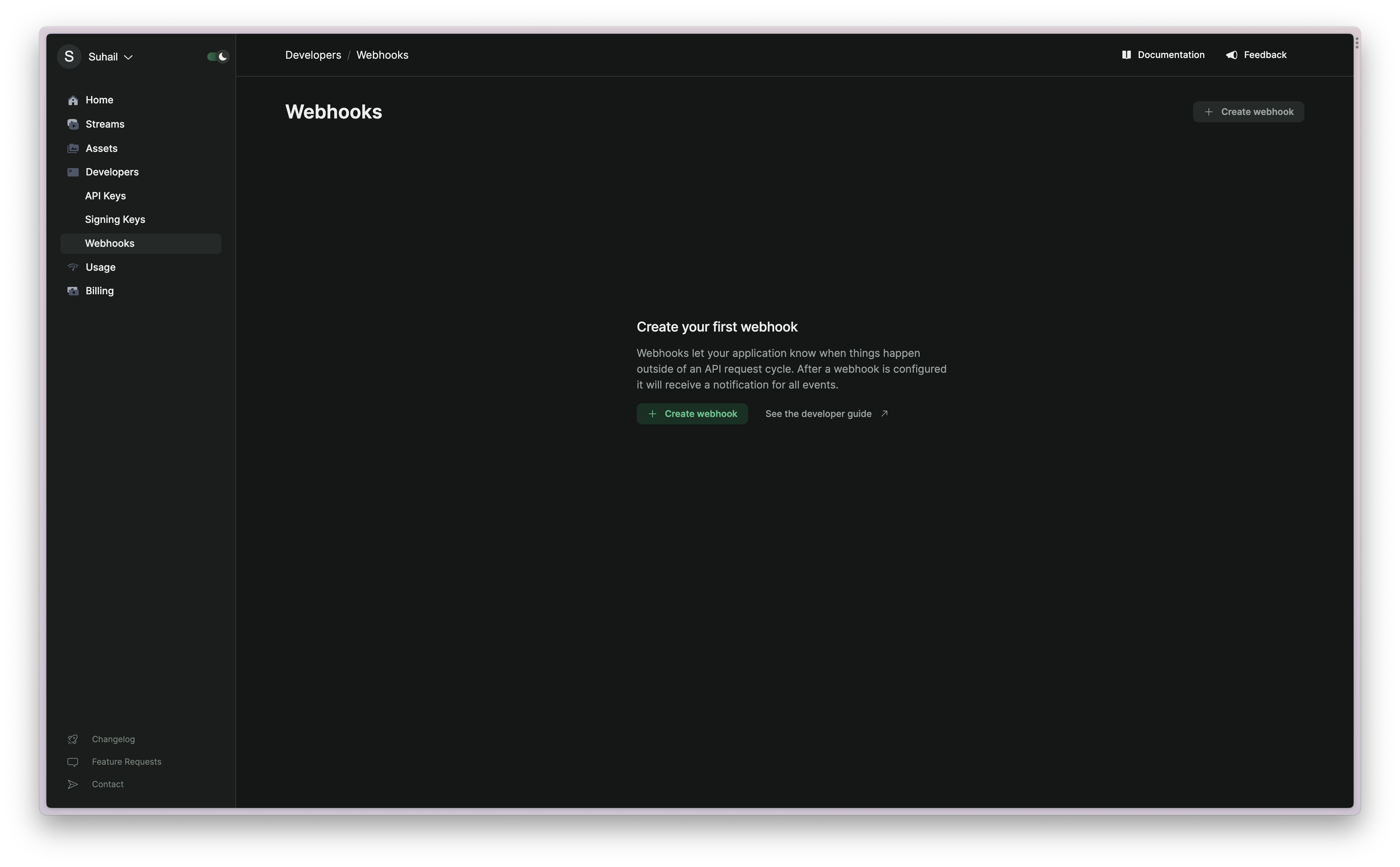
Set up a webhook endpoint

The first step is to set up a webhook endpoint in your application. This is the URL that Livepeer Studio will send the event to. Learn more about setting up a webhook endpoint.

Add a webhook URL to Livepeer Studio

Log in to the Livepeer Studio and navigate to the Developers/Webhooks page.
Webhooks
Click the “Create Webhook” button and enter URL of webhook endpoint. Select any stream event (with stream/multistream prefix) to receive notifications for and click “Create Webhook”.
Last modified on March 18, 2026