. Not present in production builds. Safe no-op in prod. */ body { padding: 0 !important; } /* Colors Used #3CB540 - Jade Green #2b9a66 - Light Green #18794E - Dark Green Complementary Greens See https://coolors.co/004225-1a794e-08a045-3cb540-62ba4f #004225 - Deep Forrest #1A794E - Turf Green #08A045 - Medium Jungle #3CB540 - Jade Green #6BBF59 - Moss Green See https://coolors.co/0c0c0c-073b3a-1a794e-08a045-6bbf59 #0C0C0C - Onyx Black #073B3A - Dark Teal #1A794E - Turf Green #08A045 - Medium Jungle #6BBF59 - Moss Green See https://coolors.co/fffffa-073b3a-1a794e-08a045-6bbf59 #FFFFFA - Porcelain #073B3A - Dark Teal #1A794E - Turf Green #08A045 - Medium Jungle #6BBF59 - Moss Green Pink Offset Colour See https://coolors.co/073b3a-1a794e-f61067-08a045-6bbf59 #F61067 - Razzmatazz Pink #073B3A - Dark Teal #1A794E - Turf Green #08A045 - Medium Jungle #6BBF59 - Moss Green */ /* ============================================ GLOBAL THEME VARIABLES Component governance source of truth ============================================ */ :root { --lp-color-accent: #3cb540; --lp-color-accent-strong: #18794e; --lp-color-accent-soft: #6bbf59; --lp-color-accent-bright: #5dd662; --lp-color-accent-brightest: #a0f0a5; --lp-color-arbitrum: #3ea6f8; --lp-color-text-primary: #181c18; --lp-color-text-secondary: #717571; --lp-color-text-muted: #9ca3af; --lp-color-bg-page: #ffffff; --lp-color-bg-card: #f9fafb; --lp-color-bg-elevated: #f3f6f4; --lp-color-bg-subtle: rgba(24, 28, 24, 0.04); --lp-color-bg-overlay: rgba(12, 12, 12, 0.5); --lp-color-border-default: #e5e7eb; --lp-color-border-strong: rgba(24, 28, 24, 0.18); --lp-color-border-inverse: rgba(255, 255, 255, 0.5); --lp-color-on-accent: #ffffff; --lp-color-link: #18794e; --lp-color-link-hover: #004225; --lp-color-brand-discord: #5865f2; --lp-color-brand-forum: #00aeef; --lp-color-brand-github: #181c18; --lp-color-brand-x: #181c18; --lp-color-brand-globe: #00c0ff; --lp-color-brand-twitch: #9048ff; --lp-color-brand-youtube: #ff0034; --lp-color-brand-instagram: #dc2275; --lp-color-brand-linkedin: #0189df; --lp-color-brand-preview: #b636dd; --lp-color-brand-coming-soon: #ef1a73; --lp-color-brand-linux: #ff9a0e; --lp-color-brand-windows: #14bbf7; --lp-color-brand-macos: #60ba47; --lp-color-status-good: #22c55e; --lp-color-status-warn: #fbbf24; --lp-color-status-bad: #ef4444; --lp-spacing-1: 0.25rem; --lp-spacing-2: 0.5rem; --lp-spacing-3: 0.75rem; --lp-spacing-4: 1rem; --lp-spacing-6: 1.5rem; --lp-spacing-8: 2rem; --lp-spacing-px-3: 3px; --lp-spacing-px-4: 4px; --lp-spacing-px-6: 6px; --lp-spacing-px-8: 8px; --lp-spacing-px-12: 12px; --lp-font-sans: 'Inter', 'Segoe UI', sans-serif; --lp-font-mono: 'SFMono-Regular', 'SF Mono', 'Menlo', monospace; --lp-radius-sm: 0.25rem; --lp-radius-md: 0.5rem; --lp-radius-lg: 0.75rem; --lp-shadow-card: 0 8px 24px rgba(24, 28, 24, 0.08); --lp-z-base: 1; --lp-z-overlay: 10; --lp-z-modal: 50; /* Legacy aliases maintained during migration */ --accent: var(--lp-color-accent); --accent-dark: var(--lp-color-accent-strong); --hero-text: var(--lp-color-text-primary); --text: var(--lp-color-text-secondary); --text-secondary: var(--lp-color-text-secondary); --muted-text: var(--lp-color-text-muted); --background: var(--lp-color-bg-page); --card-background: var(--lp-color-bg-card); --background-highlight: var(--lp-color-bg-subtle); --border: var(--lp-color-border-default); --button-text: var(--lp-color-on-accent); --page-header-description-color: var(--lp-color-text-secondary); --arbitrum: var(--lp-color-arbitrum); } .dark { --lp-color-accent: #2b9a66; --lp-color-accent-strong: #18794e; --lp-color-accent-soft: #3cb540; --lp-color-accent-bright: #5dd662; --lp-color-accent-brightest: #7fe584; --lp-color-text-primary: #e0e4e0; --lp-color-text-secondary: #a0a4a0; --lp-color-text-muted: #6b7280; --lp-color-bg-page: #0d0d0d; --lp-color-bg-card: #1a1a1a; --lp-color-bg-elevated: #141a16; --lp-color-bg-subtle: rgba(255, 255, 255, 0.1); --lp-color-bg-overlay: rgba(0, 0, 0, 0.5); --lp-color-border-default: #333333; --lp-color-border-strong: rgba(255, 255, 255, 0.3); --lp-color-border-inverse: rgba(255, 255, 255, 0.5); --lp-color-on-accent: #ffffff; --lp-color-link: #5dd662; --lp-color-link-hover: #a0f0a5; --lp-color-brand-github: #f0f0f0; /* Legacy aliases maintained during migration */ --accent: var(--lp-color-accent); --accent-dark: var(--lp-color-accent-strong); --hero-text: var(--lp-color-text-primary); --text: var(--lp-color-text-secondary); --text-secondary: var(--lp-color-text-secondary); --muted-text: var(--lp-color-text-muted); --background: var(--lp-color-bg-page); --card-background: var(--lp-color-bg-card); --background-highlight: var(--lp-color-bg-subtle); --border: var(--lp-color-border-default); --button-text: var(--lp-color-on-accent); --page-header-description-color: var(--lp-color-text-secondary); --arbitrum: var(--lp-color-arbitrum); } /* ============================================ */ /* Code block themes hiki codeblock themes: Popular Dark Themes: github-dark (what you have now) github-dark-dimmed github-dark-high-contrast dracula dracula-soft monokai nord one-dark-pro poimandres rose-pine everforest-dark vitesse-dark Popular Light Themes: github-light (what you have now) github-light-high-contrast solarized-light rose-pine-dawn everforest-light vitesse-light */ /* img[alt="dark logo"], img[alt="light logo"] { max-width: 180px; } */ /* V2 TEST */ /* a.nav-tabs-item[href="/pages/resources/resources_hub.mdx"], a.nav-tabs-item[href="/pages/08_help/README"] { color: rgba(255, 90, 90, 0.342) !important; } */ /* Make the nav-tabs container full width */ .nav-tabs { width: 100%; justify-content: flex-start; } /* Fix Mintlify content width and centering. Regular pages: balance padding + widen inner cap. Portal/frame pages: balance padding (smaller) + widen inner cap for full-width hero. */ @media (min-width: 1024px) { /* Regular pages */ #content-container:not(:has(.frame-mode-hero-full)):not( :has(.frame-mode-container) ) { padding-left: 3rem !important; padding-right: 3rem !important; } #content-container:not(:has(.frame-mode-hero-full)):not( :has(.frame-mode-container) ) > .max-w-5xl { max-width: 72rem !important; } /* Portal/frame pages — tighter balanced padding, wider inner cap */ #content-container:has(.frame-mode-hero-full), #content-container:has(.frame-mode-container) { padding-left: 2rem !important; padding-right: 2rem !important; } #content-container:has(.frame-mode-hero-full) > .max-w-5xl, #content-container:has(.frame-mode-container) > .max-w-5xl { max-width: 80rem !important; } } #navbar > div.z-10.mx-auto.relative > div.hidden.lg\:flex.px-12.h-12 > div { column-gap: 2rem !important; } a.nav-tabs-item[href*='/internal/'] { margin-left: 1rem; margin-right: -1rem; padding-right: 0; border-bottom-color: transparent !important; } /* .gap-x-6 { column-gap: 2rem !important; } */ /* .nav-tabs h-full flex text-sm gap-x-6 { column-gap: 2rem !important; } */ /* Push Resource HUB to the right and style as outlined button */ a.nav-tabs-item[href$='/resources/redirect'], a.nav-tabs-item[href$='/resources/portal'], a.nav-tabs-item[href$='/07_resources/redirect'], a.nav-tabs-item[href$='/07_resources/portal'] { margin-left: auto; background-color: transparent; border: 1px solid var(--accent) !important; padding: 4px 8px; border-radius: 4px; font-size: 0.7rem; height: auto !important; align-self: center; margin-right: -2rem; } /* Color the text */ /* a.nav-tabs-item[href="/v2/resources/resources_hub"] { color: #2b9a66 !important; } */ /* Shrink & color the icon */ a.nav-tabs-item[href$='/resources/redirect'] svg, a.nav-tabs-item[href$='/resources/portal'] svg, a.nav-tabs-item[href$='/07_resources/redirect'] svg, a.nav-tabs-item[href$='/07_resources/portal'] svg, a.nav-tabs-item[href$='/07_resources/resources_hub'] svg { height: 0.75rem; width: 0.75rem; /* background-color: #2b9a66 !important; */ } /* Hide the underline on the button */ a.nav-tabs-item[href$='/resources/redirect'] > div:last-child, a.nav-tabs-item[href$='/resources/portal'] > div:last-child, a.nav-tabs-item[href$='/07_resources/redirect'] > div:last-child, a.nav-tabs-item[href$='/07_resources/portal'] > div:last-child, a.nav-tabs-item[href$='/07_resources/resources_hub'] > div:last-child { display: none; } /* Stack footer links vertically */ #footer .flex-col .flex.gap-4 { flex-direction: column !important; gap: 0rem !important; } /* Reduce footer padding */ #footer > div { padding-top: 2rem !important; padding-bottom: 1rem !important; } /* Accessibility: prevent hidden assistant sheet from receiving focus */ #chat-assistant-sheet[aria-hidden='true'] { display: none !important; } /* Accessibility: ensure CTA buttons meet minimum target size */ button.text-left.text-gray-600.text-sm.font-medium { min-height: 24px; padding-top: 4px; padding-bottom: 4px; } /* #footer > div > div:first-child { display: flex; flex-direction: row !important; color: red !important; } #footer > div > div:first-child > div { display: flex; flex-direction: row !important; color: green !important; } */ /* Fix bad styling of cards with arrows */ [data-component-part='card-content-container'] { padding-right: 2.5rem; /* Creates space for the arrow */ } /* Reposition View component dropdown */ /* To find the correct selector: 1. Open your page with View components in the browser 2. Right-click on the dropdown in the top-right corner 3. Select "Inspect Element" 4. Find the class name or data attribute 5. Replace the selector below with the actual one */ /* Common possible selectors - uncomment and adjust the one that works */ /* Option 1: If it has a data attribute */ /* [data-view-dropdown] { position: relative !important; top: 60px !important; right: 20px !important; } */ /* Option 2: If it's in a fixed container */ /* .fixed [class*="view"] { position: relative !important; top: 60px !important; } */ /* Option 3: Target by position (fixed elements in top-right) */ /* .fixed.top-0.right-0 [class*="select"], .fixed.top-0.right-0 [class*="dropdown"] { position: relative !important; top: 60px !important; margin-right: 20px !important; } */ /* Option 4: Move it inline with content instead of fixed position */ /* Replace 'ACTUAL_SELECTOR' with the real class name from browser inspection */ /* ACTUAL_SELECTOR { position: static !important; display: inline-block !important; margin-bottom: 20px !important; } */ .code-block > div > div > svg { background-color: #18794e !important; } /* Error 404 Styling */ #error-description > span > div > div { border: 1px solid #18794e !important; } body > div.relative.antialiased.text-gray-500.dark\:text-gray-400 > div.peer-\[\.is-not-custom\]\:lg\:flex.peer-\[\.is-custom\]\:\[\&\>div\:first-child\]\:\!hidden.peer-\[\.is-custom\]\:\[\&\>div\:first-child\]\:sm\:\!hidden.peer-\[\.is-custom\]\:\[\&\>div\:first-child\]\:md\:\!hidden.peer-\[\.is-custom\]\:\[\&\>div\:first-child\]\:lg\:\!hidden.peer-\[\.is-custom\]\:\[\&\>div\:first-child\]\:xl\:\!hidden > div.flex.flex-col.items-center.justify-center.w-full.max-w-lg.overflow-x-hidden.mx-auto.py-48.px-5.text-center.\*\:text-center.gap-y-8.not-found-container > div { margin-top: -5rem; } #error-description > span > div > div > div.relative.rounded-xl.overflow-hidden.flex.justify-center > img { width: 500px; aspect-ratio: 4 / 3; object-fit: cover; /* border: 1px solid #fff; */ } /* Step List Color Icons Styling */ /* #content > div.steps > div > div.absolute.ml-\[-13px\].py-2 > div { background-color: #18794e !important; } */ /* Step List Color Titles */ #content > div.steps.ml-3\.5.mt-10.mb-6 > div > div.w-full.overflow-hidden.pl-8.pr-px > p { color: #2b9a66 !important; } /* View Dropdown */ /* #radix-_R_5slubt9fen9fdb_ */ /* Turn off bg-white in dark mode for multi-view dropdown (PALM THEME BUG) */ .dark .bg-white\/\[0\.95\].multi-view-dropdown-trigger { background-color: transparent !important; background: none !important; } /* Sidebar collapse button - bigger and easier to click */ /* #sidebar button.absolute { min-width: 2.5rem !important; min-height: 2.5rem !important; padding: 0.75rem !important; z-index: 100 !important; } */ /* Override US flag with UK flag in language selector */ /* Hide the original img and use background-image instead */ /* #localization-select-trigger img[alt="US"], #localization-select-item-en img[alt="US"], img[alt="US"][src*="flags/US.svg"] { opacity: 0 !important; position: relative !important; } #localization-select-trigger img[alt="US"]::before, #localization-select-item-en img[alt="US"]::before, img[alt="US"][src*="flags/US.svg"]::before { content: "" !important; position: absolute !important; top: 0 !important; left: 0 !important; width: 100% !important; height: 100% !important; background-image: url("/snippets/assets/media/images/site/united-kingdom-flag-icon.svg") !important; background-size: cover !important; background-position: center !important; border-radius: 50% !important; opacity: 1 !important; } */ /* Hide the panel on frame mode pages (MINTLIFY SUCKS) */ /* Hide empty table of contents layout only when it's empty */ #table-of-contents-layout:empty, #content-side-layout:has(#table-of-contents-layout:empty) { display: none; } /* DynamicTable: force fixed layout so columnWidths prop values take effect. Mintlify's Tailwind prose resets table-layout to auto — !important required. */ [data-docs-dynamic-table] { table-layout: fixed !important; } /* StyledTable should sit flush inside its own border shell. Mint wraps rendered tables in a scroll container with vertical padding, which creates a false gap above/below the header row. */ [data-docs-styled-table-shell] > div { padding-top: 0 !important; padding-bottom: 0 !important; margin-top: 0 !important; margin-bottom: 0 !important; } /* BorderedBox should own its internal spacing. Trim default block margins on the first/last rendered child so headings and paragraphs do not add a false gap inside the padded shell. */ [data-docs-bordered-box] > :first-child { margin-top: 0 !important; } [data-docs-bordered-box] > :last-child { margin-bottom: 0 !important; } [data-docs-bordered-box][data-accent-bar]::before { content: ""; position: absolute; top: 0; bottom: 0; left: 0; width: 4px; background-color: var(--accent-bar-color); border-radius: inherit; border-top-right-radius: 0; border-bottom-right-radius: 0; } /* Frame mode container - 80% of #content-container width, centered */ /* Breaks out of #content padding to center in full #content-container */ .frame-mode-container { width: calc(100% + 96px + 20px); /* 976px */ margin-left: -96px; margin-right: -20px; margin-bottom: 2rem; padding-left: 15%; /* Adjust this for desired content width */ padding-right: 15%; /* Adjust this for desired content width */ box-sizing: border-box; } /* Frame mode container inside hero - already broken out, so reset */ .frame-mode-hero-full .frame-mode-container { width: 100%; margin-left: 0; margin-right: 0; padding-left: 0%; padding-right: 0%; } /* Pagination on frame mode pages ONLY - match container padding */ [data-page-mode='frame'] #pagination { width: calc(100% + 96px + 20px); margin-left: -96px; margin-right: -20px; padding-left: calc((100% + 96px + 20px) * 0.1 + 96px); padding-right: calc((100% + 96px + 20px) * 0.1 + 20px); box-sizing: border-box; } /* Hero full width - breaks out of #content padding to fill #content-container */ .frame-mode-hero-full { width: calc(100% + 96px + 20px); margin-left: -96px; margin-right: -20px; position: relative; } @media (max-width: 1023px) { .frame-mode-container { width: 100%; margin-left: 0; margin-right: 0; padding-left: 1rem; padding-right: 1rem; } [data-page-mode='frame'] #pagination { width: 100%; margin-left: 0; margin-right: 0; padding-left: 1rem; padding-right: 1rem; } .frame-mode-hero-full { width: 100%; margin-left: 0; margin-right: 0; } } #starfield { position: absolute; inset: 0; width: 100%; height: 100%; pointer-events: none; z-index: 0; } /* Target the card content container */ .frame-mode-hero-full [data-component-part='card-content-container'] { padding-top: 0.5rem; padding-bottom: 0.5rem; padding-left: 1rem; padding-right: 2.5rem; /* Space for arrow icon (0.75rem right + icon width ~1rem + margin) */ } /* Target the arrow icon */ .frame-mode-hero-full #card-link-arrow-icon { top: 0.75rem; right: 0.75rem; } /* #content > div.frame-mode-hero-full > div.frame-mode-container > div > div:nth-child(2) > div > div > div:nth-child(4) > a > div { padding-top: 0.5rem; padding-bottom: 0.5rem; } #content > div.frame-mode-hero-full > div.frame-mode-container > div > div:nth-child(2) > div > div > div:nth-child(4) > a > div > #card-link-arrow-icon { top: 0.75rem; right: 0.75rem; } */ /* ============================================ ACCESSIBILITY — Focus indicators ============================================ */ input:focus-visible, select:focus-visible, textarea:focus-visible, button:focus-visible, a:focus-visible, [tabindex]:focus-visible { outline: 2px solid var(--accent) !important; outline-offset: 2px; } /* ============================================ ACCESSIBILITY — Responsive breakpoints ============================================ */ @media (max-width: 767px) { .frame-mode-hero-full { width: 100%; max-width: 100%; overflow-x: hidden; } } @media (max-width: 480px) { #content { padding-left: 1rem; padding-right: 1rem; } } /* ============================================ UTILITY CLASSES — inline element styling Used where components can't replace inline spans (e.g., inside Mintlify , components) ============================================ */ .lp-inline-flex { display: flex; align-items: center; } .lp-text-muted { color: var(--lp-color-text-secondary); } .lp-text-italic-muted { font-style: italic; color: var(--lp-color-text-secondary); } .lp-inline-flex-gap { display: flex; align-items: center; gap: 0.2rem; } .lp-link-underline { border-bottom: 1.5px solid var(--lp-color-text-primary); color: var(--lp-color-text-primary); padding-bottom: 0.25rem; }
This guide provides instructions for the one-time migration from the L1 Ethereum Mainnet to the L2 Arbitrum Mainnet, as per the Livepeer Confluence upgrade. This guide is designed for node operators who have not yet upgraded to a Livepeer version >=0.5.28, connecting to Arbitrum Mainnet after the LIP-73 block.

Prerequisites for all chains

  • Your connected Ethereum account should have enough ETH to cover gas for the migrate transaction. If you do not have ETH in your wallet, you can add some using another wallet or an on-ramp so you can buy enough for the migrate transaction.
  • You can complete the migration using the Livepeer Explorer. Alternatively, you may opt to sign a typed data message via livepeer_cli, instead.
  • Ensure you are interacting with the correct contracts. Addresses can be found here.
  • If you use a contract account rather than an EOA: You will need to interact directly with the Migrator contract methods following the Contract Wallet Migration guide.
If you are not familiar with this, it may not apply to you.
  • Use a go-livepeer release >= 0.5.28.
  • To register your Orchestrator on the destination chain, bridge some ETH to pay for the transaction.

On Mainnet

This guide applies to orchestrators who registered on-chain on the Ethereum mainnet prior to February 14th, 2022. It can be used starting on February 14th, 2022 onward.
Once you have successfully completed the migration, this guide is no longer applicable and you will use Arbitrum in lieu of Ethereum for all protocol actions.
Before starting the migration process, you will need to acquire an RPC url for Arbitrum:

On Testnet

This guide is applicable to orchestrators who registered on-chain on Rinkeby prior to January 24th, 2022. Note: Once you have successfully completed the migration, this guide is no longer applicable and you will use Arbitrum Rinkeby in lieu of Rinkeby for all protocol actions. Before starting the migration process, you will need to acquire an RPC url for Arbitrum. We recommend using the Offchain Labs public testnet endpoint. Alternatively, you can:
For example:

Migrating to Arbitrum

  1. Connect your wallet If you have not connected a wallet, connect one using the prompt in the upper left-hand corner of the Livepeer Explorer. The wallet you choose should contain a small amount of ETH to pay for the migrate transaction.
    Note: You do not have to use the same wallet you use for your orchestrator. However, if you are using a different wallet to submit the transaction, you will still need to access the wallet that you use for your orchestrator so that you can sign a typed data message.
    For example: connect wallet to livepeer
    connect wallet to livepeer options
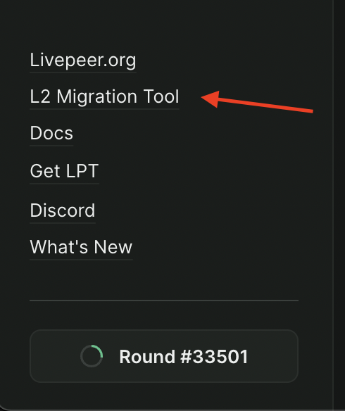
  2. Navigate to the L2 Migration Tool to begin migration to Arbitrum:
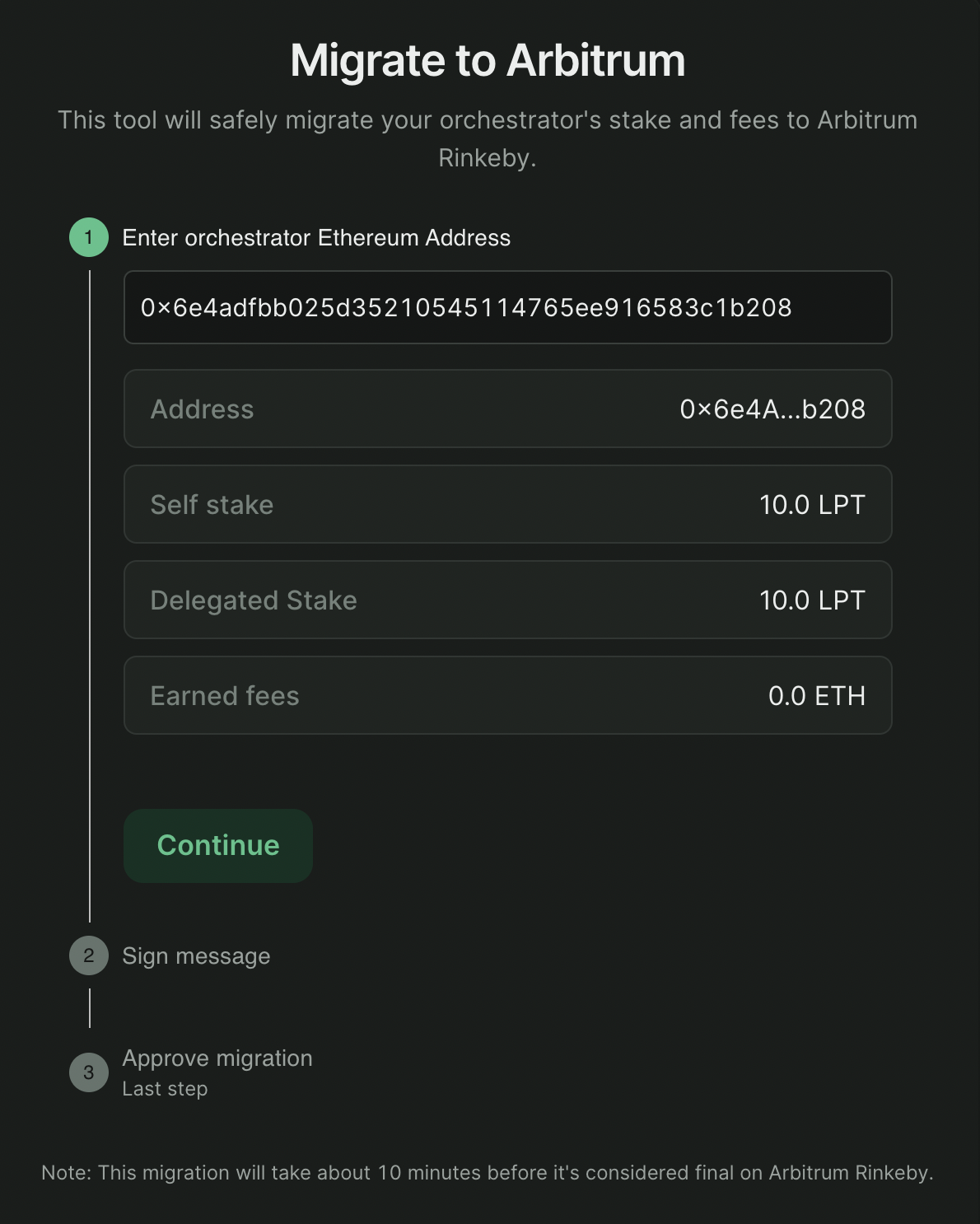
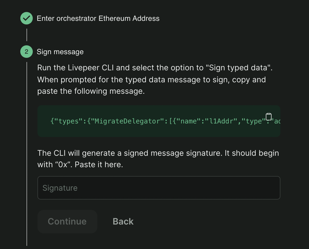
begin migration
  1. Sign the migrate transaction: You can sign to authorize the migration transaction with one of the following: 4a. Sign using a connected wallet. If you prefer to sign using the wallet that you have connected to the explorer, click “Approve Migration” and approve the transaction using your browser extension. sign web 4b. Sign using the 
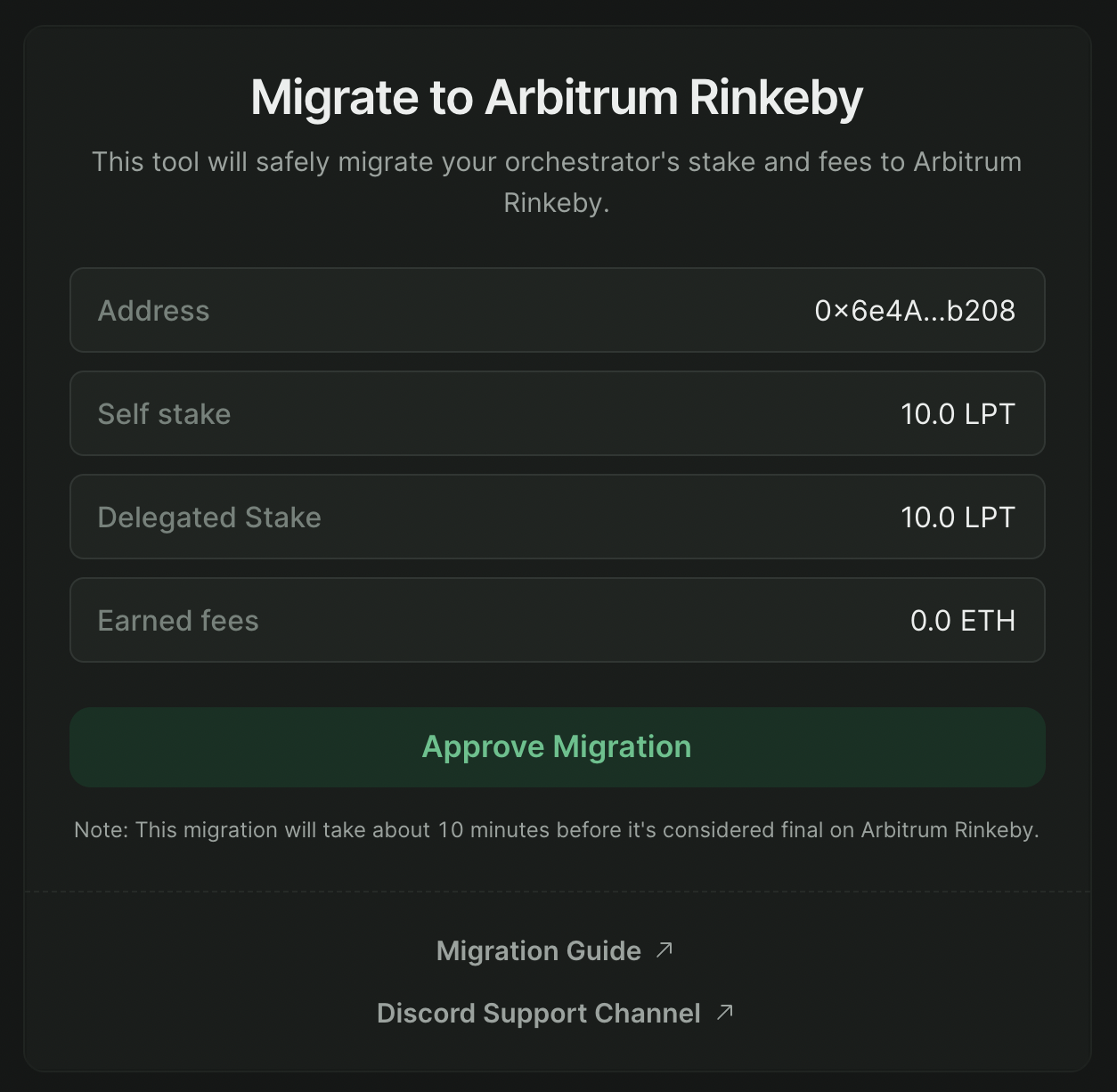
livepeer_cli. If you prefer to sign a typed data message through the livepeer_cli, connect your wallet to the explorer with any other account. You will be prompted to enter the public address of the orchestrator you wish to migrate.
    Note: If you are signing with the CLI and your connected wallet is NOT your orchestrator wallet, the stake amount will not appear until after you enter your Ethereum account address.
    sign cli Once you have entered an address, you will see a message to sign and a text entry box for the signature.
  • Copy the message provided. Then go into your CLI and select option 19: Sign Typed Data. sign cli
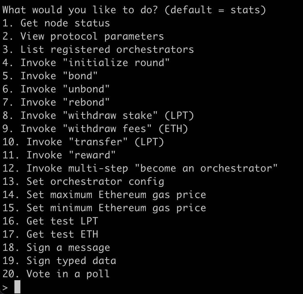
  • Follow the CLI’s prompts to generate a signature. Note: For Windows users, after pasting the typed data you will need to type ctrl+Z, instead of ctrl+D. sign cli
  • Paste this message in the provided box and click Continue. sign cli
  • Click Approve Migration to send the transaction to Ethereum. The connected browser wallet will pay gas, but it will use the provided signature.
  1. View your profile: Once the migrate transaction has been confirmed (this usually takes up to 10 minutes between mainnet and Arbitrum), you should see a link to your profile where you will be able to see your newly claimed balances. You will see an Arbiscan link to the transaction id to view the submitted transaction.
  2. Restart your Orchestrator, pointing at Arbitrum instead of mainnet as follows: 5a. Find your Arbitrum RPC Url
    Note: If you prefer to run your own Arbitrum node, you should start it at this time. Otherwise, you should find the Arbitrum RPC Url that you created at the beginning of this guide.
    5b. Restart your Orchestrator with an updated configuration Once you are ready, you should restart your orchestrator using your usual flags, changing only the network and ethUrl.
Error Note: If you’re running on the same machine as your mainnet Orchestrator, you may encounter an error: For example: You were expecting chainID of 4, but got 421611 instead. You may have changed networks without changing network name or datadir. This indicates your testnet setup is trying to access the same .lpData that it used for mainnet, and it is finding a conflict on chainId. To fix this error:
  • Specify a new data directory using the -datadir flag when you start your Orchestrator. Specify only the directory, not the file. Additionally, you may need to copy your keystore to /.lpData/arbitrum-one-< mainnet / rinkeby >/keystore.
    livepeer \
      -network arbitrum-one-mainnet # testnet: arbitrum-one-rinkeby
      -ethUrl <Arbitrum RPC Url> # testnet: arbitrum rinkeby RPC url
    
  1. Register your service URI and fee structure on Arbitrum using Set orchestrator config:
To receive work, you must register your service URI and fees so that gateways can discover your orchestrator. > 6a. Select the following option using livepeer_cli: 13: Set orchestrator config > 6b. Acquire some arbETH to pay for the transaction:
  • Use the Arbitrum bridge to send Ethereum on Layer 1, to Arbitrum on Layer 2, over the appropriate (i.e. Mainnet or Rinkeby) network.
Once this is complete, you are all set to receive work, rewards, and fees on Arbitrum. Note: In the future, you’ll be prompted to connect to the Livepeer Explorer using Arbitrum, and all future rewards and fees will accrue to Arbitrum rather than Ethereum.
Last modified on April 11, 2026