.
Not present in production builds. Safe no-op in prod. */
body {
padding: 0 !important;
}
/* Colors Used
#3CB540 - Jade Green
#2b9a66 - Light Green
#18794E - Dark Green
Complementary Greens
See https://coolors.co/004225-1a794e-08a045-3cb540-62ba4f
#004225 - Deep Forrest
#1A794E - Turf Green
#08A045 - Medium Jungle
#3CB540 - Jade Green
#6BBF59 - Moss Green
See https://coolors.co/0c0c0c-073b3a-1a794e-08a045-6bbf59
#0C0C0C - Onyx Black
#073B3A - Dark Teal
#1A794E - Turf Green
#08A045 - Medium Jungle
#6BBF59 - Moss Green
See https://coolors.co/fffffa-073b3a-1a794e-08a045-6bbf59
#FFFFFA - Porcelain
#073B3A - Dark Teal
#1A794E - Turf Green
#08A045 - Medium Jungle
#6BBF59 - Moss Green
Pink Offset Colour
See https://coolors.co/073b3a-1a794e-f61067-08a045-6bbf59
#F61067 - Razzmatazz Pink
#073B3A - Dark Teal
#1A794E - Turf Green
#08A045 - Medium Jungle
#6BBF59 - Moss Green
*/
/* ============================================
GLOBAL THEME VARIABLES
Component governance source of truth
============================================ */
:root {
--lp-color-accent: #3cb540;
--lp-color-accent-strong: #18794e;
--lp-color-accent-soft: #6bbf59;
--lp-color-accent-bright: #5dd662;
--lp-color-accent-brightest: #a0f0a5;
--lp-color-arbitrum: #3ea6f8;
--lp-color-text-primary: #181c18;
--lp-color-text-secondary: #717571;
--lp-color-text-muted: #9ca3af;
--lp-color-bg-page: #ffffff;
--lp-color-bg-card: #f9fafb;
--lp-color-bg-elevated: #f3f6f4;
--lp-color-bg-subtle: rgba(24, 28, 24, 0.04);
--lp-color-bg-overlay: rgba(12, 12, 12, 0.5);
--lp-color-border-default: #e5e7eb;
--lp-color-border-strong: rgba(24, 28, 24, 0.18);
--lp-color-border-inverse: rgba(255, 255, 255, 0.5);
--lp-color-on-accent: #ffffff;
--lp-color-link: #18794e;
--lp-color-link-hover: #004225;
--lp-color-brand-discord: #5865f2;
--lp-color-brand-forum: #00aeef;
--lp-color-brand-github: #181c18;
--lp-color-brand-x: #181c18;
--lp-color-brand-globe: #00c0ff;
--lp-color-brand-twitch: #9048ff;
--lp-color-brand-youtube: #ff0034;
--lp-color-brand-instagram: #dc2275;
--lp-color-brand-linkedin: #0189df;
--lp-color-brand-preview: #b636dd;
--lp-color-brand-coming-soon: #ef1a73;
--lp-color-brand-linux: #ff9a0e;
--lp-color-brand-windows: #14bbf7;
--lp-color-brand-macos: #60ba47;
--lp-color-status-good: #22c55e;
--lp-color-status-warn: #fbbf24;
--lp-color-status-bad: #ef4444;
--lp-spacing-1: 0.25rem;
--lp-spacing-2: 0.5rem;
--lp-spacing-3: 0.75rem;
--lp-spacing-4: 1rem;
--lp-spacing-6: 1.5rem;
--lp-spacing-8: 2rem;
--lp-spacing-px-3: 3px;
--lp-spacing-px-4: 4px;
--lp-spacing-px-6: 6px;
--lp-spacing-px-8: 8px;
--lp-spacing-px-12: 12px;
--lp-font-sans: 'Inter', 'Segoe UI', sans-serif;
--lp-font-mono: 'SFMono-Regular', 'SF Mono', 'Menlo', monospace;
--lp-radius-sm: 0.25rem;
--lp-radius-md: 0.5rem;
--lp-radius-lg: 0.75rem;
--lp-shadow-card: 0 8px 24px rgba(24, 28, 24, 0.08);
--lp-z-base: 1;
--lp-z-overlay: 10;
--lp-z-modal: 50;
/* Legacy aliases maintained during migration */
--accent: var(--lp-color-accent);
--accent-dark: var(--lp-color-accent-strong);
--hero-text: var(--lp-color-text-primary);
--text: var(--lp-color-text-secondary);
--text-secondary: var(--lp-color-text-secondary);
--muted-text: var(--lp-color-text-muted);
--background: var(--lp-color-bg-page);
--card-background: var(--lp-color-bg-card);
--background-highlight: var(--lp-color-bg-subtle);
--border: var(--lp-color-border-default);
--button-text: var(--lp-color-on-accent);
--page-header-description-color: var(--lp-color-text-secondary);
--arbitrum: var(--lp-color-arbitrum);
}
.dark {
--lp-color-accent: #2b9a66;
--lp-color-accent-strong: #18794e;
--lp-color-accent-soft: #3cb540;
--lp-color-accent-bright: #5dd662;
--lp-color-accent-brightest: #7fe584;
--lp-color-text-primary: #e0e4e0;
--lp-color-text-secondary: #a0a4a0;
--lp-color-text-muted: #6b7280;
--lp-color-bg-page: #0d0d0d;
--lp-color-bg-card: #1a1a1a;
--lp-color-bg-elevated: #141a16;
--lp-color-bg-subtle: rgba(255, 255, 255, 0.1);
--lp-color-bg-overlay: rgba(0, 0, 0, 0.5);
--lp-color-border-default: #333333;
--lp-color-border-strong: rgba(255, 255, 255, 0.3);
--lp-color-border-inverse: rgba(255, 255, 255, 0.5);
--lp-color-on-accent: #ffffff;
--lp-color-link: #5dd662;
--lp-color-link-hover: #a0f0a5;
--lp-color-brand-github: #f0f0f0;
/* Legacy aliases maintained during migration */
--accent: var(--lp-color-accent);
--accent-dark: var(--lp-color-accent-strong);
--hero-text: var(--lp-color-text-primary);
--text: var(--lp-color-text-secondary);
--text-secondary: var(--lp-color-text-secondary);
--muted-text: var(--lp-color-text-muted);
--background: var(--lp-color-bg-page);
--card-background: var(--lp-color-bg-card);
--background-highlight: var(--lp-color-bg-subtle);
--border: var(--lp-color-border-default);
--button-text: var(--lp-color-on-accent);
--page-header-description-color: var(--lp-color-text-secondary);
--arbitrum: var(--lp-color-arbitrum);
}
/* ============================================ */
/* Code block themes
hiki codeblock themes:
Popular Dark Themes:
github-dark (what you have now)
github-dark-dimmed
github-dark-high-contrast
dracula
dracula-soft
monokai
nord
one-dark-pro
poimandres
rose-pine
everforest-dark
vitesse-dark
Popular Light Themes:
github-light (what you have now)
github-light-high-contrast
solarized-light
rose-pine-dawn
everforest-light
vitesse-light */
/* img[alt="dark logo"],
img[alt="light logo"] {
max-width: 180px;
} */
/* V2 TEST */
/* a.nav-tabs-item[href="/pages/resources/resources_hub.mdx"],
a.nav-tabs-item[href="/pages/08_help/README"] {
color: rgba(255, 90, 90, 0.342) !important;
} */
/* Make the nav-tabs container full width */
.nav-tabs {
width: 100%;
justify-content: flex-start;
}
/* Fix Mintlify content width and centering.
Regular pages: balance padding + widen inner cap.
Portal/frame pages: balance padding (smaller) + widen inner cap for full-width hero. */
@media (min-width: 1024px) {
/* Regular pages */
#content-container:not(:has(.frame-mode-hero-full)):not(
:has(.frame-mode-container)
) {
padding-left: 3rem !important;
padding-right: 3rem !important;
}
#content-container:not(:has(.frame-mode-hero-full)):not(
:has(.frame-mode-container)
)
> .max-w-5xl {
max-width: 72rem !important;
}
/* Portal/frame pages — tighter balanced padding, wider inner cap */
#content-container:has(.frame-mode-hero-full),
#content-container:has(.frame-mode-container) {
padding-left: 2rem !important;
padding-right: 2rem !important;
}
#content-container:has(.frame-mode-hero-full) > .max-w-5xl,
#content-container:has(.frame-mode-container) > .max-w-5xl {
max-width: 80rem !important;
}
}
#navbar > div.z-10.mx-auto.relative > div.hidden.lg\:flex.px-12.h-12 > div {
column-gap: 2rem !important;
}
a.nav-tabs-item[href*='/internal/'] {
margin-left: 1rem;
margin-right: -1rem;
padding-right: 0;
border-bottom-color: transparent !important;
}
/* .gap-x-6 {
column-gap: 2rem !important;
} */
/* .nav-tabs h-full flex text-sm gap-x-6 {
column-gap: 2rem !important;
} */
/* Push Resource HUB to the right and style as outlined button */
a.nav-tabs-item[href$='/resources/redirect'],
a.nav-tabs-item[href$='/resources/portal'],
a.nav-tabs-item[href$='/07_resources/redirect'],
a.nav-tabs-item[href$='/07_resources/portal'] {
margin-left: auto;
background-color: transparent;
border: 1px solid var(--accent) !important;
padding: 4px 8px;
border-radius: 4px;
font-size: 0.7rem;
height: auto !important;
align-self: center;
margin-right: -2rem;
}
/* Color the text */
/* a.nav-tabs-item[href="/v2/resources/resources_hub"] {
color: #2b9a66 !important;
} */
/* Shrink & color the icon */
a.nav-tabs-item[href$='/resources/redirect'] svg,
a.nav-tabs-item[href$='/resources/portal'] svg,
a.nav-tabs-item[href$='/07_resources/redirect'] svg,
a.nav-tabs-item[href$='/07_resources/portal'] svg,
a.nav-tabs-item[href$='/07_resources/resources_hub'] svg {
height: 0.75rem;
width: 0.75rem;
/* background-color: #2b9a66 !important; */
}
/* Hide the underline on the button */
a.nav-tabs-item[href$='/resources/redirect'] > div:last-child,
a.nav-tabs-item[href$='/resources/portal'] > div:last-child,
a.nav-tabs-item[href$='/07_resources/redirect'] > div:last-child,
a.nav-tabs-item[href$='/07_resources/portal'] > div:last-child,
a.nav-tabs-item[href$='/07_resources/resources_hub'] > div:last-child {
display: none;
}
/* Stack footer links vertically */
#footer .flex-col .flex.gap-4 {
flex-direction: column !important;
gap: 0rem !important;
}
/* Reduce footer padding */
#footer > div {
padding-top: 2rem !important;
padding-bottom: 1rem !important;
}
/* Accessibility: prevent hidden assistant sheet from receiving focus */
#chat-assistant-sheet[aria-hidden='true'] {
display: none !important;
}
/* Accessibility: ensure CTA buttons meet minimum target size */
button.text-left.text-gray-600.text-sm.font-medium {
min-height: 24px;
padding-top: 4px;
padding-bottom: 4px;
}
/* #footer > div > div:first-child {
display: flex;
flex-direction: row !important;
color: red !important;
}
#footer > div > div:first-child > div {
display: flex;
flex-direction: row !important;
color: green !important;
} */
/* Fix bad styling of cards with arrows */
[data-component-part='card-content-container'] {
padding-right: 2.5rem; /* Creates space for the arrow */
}
/* Reposition View component dropdown */
/*
To find the correct selector:
1. Open your page with View components in the browser
2. Right-click on the dropdown in the top-right corner
3. Select "Inspect Element"
4. Find the class name or data attribute
5. Replace the selector below with the actual one
*/
/* Common possible selectors - uncomment and adjust the one that works */
/* Option 1: If it has a data attribute */
/* [data-view-dropdown] {
position: relative !important;
top: 60px !important;
right: 20px !important;
} */
/* Option 2: If it's in a fixed container */
/* .fixed [class*="view"] {
position: relative !important;
top: 60px !important;
} */
/* Option 3: Target by position (fixed elements in top-right) */
/* .fixed.top-0.right-0 [class*="select"],
.fixed.top-0.right-0 [class*="dropdown"] {
position: relative !important;
top: 60px !important;
margin-right: 20px !important;
} */
/* Option 4: Move it inline with content instead of fixed position */
/* Replace 'ACTUAL_SELECTOR' with the real class name from browser inspection */
/* ACTUAL_SELECTOR {
position: static !important;
display: inline-block !important;
margin-bottom: 20px !important;
} */
.code-block > div > div > svg {
background-color: #18794e !important;
}
/* Error 404 Styling */
#error-description > span > div > div {
border: 1px solid #18794e !important;
}
body
> div.relative.antialiased.text-gray-500.dark\:text-gray-400
> div.peer-\[\.is-not-custom\]\:lg\:flex.peer-\[\.is-custom\]\:\[\&\>div\:first-child\]\:\!hidden.peer-\[\.is-custom\]\:\[\&\>div\:first-child\]\:sm\:\!hidden.peer-\[\.is-custom\]\:\[\&\>div\:first-child\]\:md\:\!hidden.peer-\[\.is-custom\]\:\[\&\>div\:first-child\]\:lg\:\!hidden.peer-\[\.is-custom\]\:\[\&\>div\:first-child\]\:xl\:\!hidden
> div.flex.flex-col.items-center.justify-center.w-full.max-w-lg.overflow-x-hidden.mx-auto.py-48.px-5.text-center.\*\:text-center.gap-y-8.not-found-container
> div {
margin-top: -5rem;
}
#error-description
> span
> div
> div
> div.relative.rounded-xl.overflow-hidden.flex.justify-center
> img {
width: 500px;
aspect-ratio: 4 / 3;
object-fit: cover;
/* border: 1px solid #fff; */
}
/* Step List Color Icons Styling */
/* #content > div.steps > div > div.absolute.ml-\[-13px\].py-2 > div {
background-color: #18794e !important;
} */
/* Step List Color Titles */
#content
> div.steps.ml-3\.5.mt-10.mb-6
> div
> div.w-full.overflow-hidden.pl-8.pr-px
> p {
color: #2b9a66 !important;
}
/* View Dropdown */
/* #radix-_R_5slubt9fen9fdb_ */
/* Turn off bg-white in dark mode for multi-view dropdown (PALM THEME BUG) */
.dark .bg-white\/\[0\.95\].multi-view-dropdown-trigger {
background-color: transparent !important;
background: none !important;
}
/* Sidebar collapse button - bigger and easier to click */
/* #sidebar button.absolute {
min-width: 2.5rem !important;
min-height: 2.5rem !important;
padding: 0.75rem !important;
z-index: 100 !important;
} */
/* Override US flag with UK flag in language selector */
/* Hide the original img and use background-image instead */
/* #localization-select-trigger img[alt="US"],
#localization-select-item-en img[alt="US"],
img[alt="US"][src*="flags/US.svg"] {
opacity: 0 !important;
position: relative !important;
}
#localization-select-trigger img[alt="US"]::before,
#localization-select-item-en img[alt="US"]::before,
img[alt="US"][src*="flags/US.svg"]::before {
content: "" !important;
position: absolute !important;
top: 0 !important;
left: 0 !important;
width: 100% !important;
height: 100% !important;
background-image: url("/snippets/assets/media/images/site/united-kingdom-flag-icon.svg") !important;
background-size: cover !important;
background-position: center !important;
border-radius: 50% !important;
opacity: 1 !important;
} */
/* Hide the panel on frame mode pages (MINTLIFY SUCKS) */
/* Hide empty table of contents layout only when it's empty */
#table-of-contents-layout:empty,
#content-side-layout:has(#table-of-contents-layout:empty) {
display: none;
}
/* DynamicTable: force fixed layout so columnWidths prop values take effect.
Mintlify's Tailwind prose resets table-layout to auto — !important required. */
[data-docs-dynamic-table] {
table-layout: fixed !important;
}
/* StyledTable should sit flush inside its own border shell.
Mint wraps rendered tables in a scroll container with vertical padding,
which creates a false gap above/below the header row. */
[data-docs-styled-table-shell] > div {
padding-top: 0 !important;
padding-bottom: 0 !important;
margin-top: 0 !important;
margin-bottom: 0 !important;
}
/* BorderedBox should own its internal spacing.
Trim default block margins on the first/last rendered child so headings
and paragraphs do not add a false gap inside the padded shell. */
[data-docs-bordered-box] > :first-child {
margin-top: 0 !important;
}
[data-docs-bordered-box] > :last-child {
margin-bottom: 0 !important;
}
[data-docs-bordered-box][data-accent-bar]::before {
content: "";
position: absolute;
top: 0;
bottom: 0;
left: 0;
width: 4px;
background-color: var(--accent-bar-color);
border-radius: inherit;
border-top-right-radius: 0;
border-bottom-right-radius: 0;
}
/* Frame mode container - 80% of #content-container width, centered */
/* Breaks out of #content padding to center in full #content-container */
.frame-mode-container {
width: calc(100% + 96px + 20px); /* 976px */
margin-left: -96px;
margin-right: -20px;
margin-bottom: 2rem;
padding-left: 15%; /* Adjust this for desired content width */
padding-right: 15%; /* Adjust this for desired content width */
box-sizing: border-box;
}
/* Frame mode container inside hero - already broken out, so reset */
.frame-mode-hero-full .frame-mode-container {
width: 100%;
margin-left: 0;
margin-right: 0;
padding-left: 0%;
padding-right: 0%;
}
/* Pagination on frame mode pages ONLY - match container padding */
[data-page-mode='frame'] #pagination {
width: calc(100% + 96px + 20px);
margin-left: -96px;
margin-right: -20px;
padding-left: calc((100% + 96px + 20px) * 0.1 + 96px);
padding-right: calc((100% + 96px + 20px) * 0.1 + 20px);
box-sizing: border-box;
}
/* Hero full width - breaks out of #content padding to fill #content-container */
.frame-mode-hero-full {
width: calc(100% + 96px + 20px);
margin-left: -96px;
margin-right: -20px;
position: relative;
}
@media (max-width: 1023px) {
.frame-mode-container {
width: 100%;
margin-left: 0;
margin-right: 0;
padding-left: 1rem;
padding-right: 1rem;
}
[data-page-mode='frame'] #pagination {
width: 100%;
margin-left: 0;
margin-right: 0;
padding-left: 1rem;
padding-right: 1rem;
}
.frame-mode-hero-full {
width: 100%;
margin-left: 0;
margin-right: 0;
}
}
#starfield {
position: absolute;
inset: 0;
width: 100%;
height: 100%;
pointer-events: none;
z-index: 0;
}
/* Target the card content container */
.frame-mode-hero-full [data-component-part='card-content-container'] {
padding-top: 0.5rem;
padding-bottom: 0.5rem;
padding-left: 1rem;
padding-right: 2.5rem; /* Space for arrow icon (0.75rem right + icon width ~1rem + margin) */
}
/* Target the arrow icon */
.frame-mode-hero-full #card-link-arrow-icon {
top: 0.75rem;
right: 0.75rem;
}
/* #content > div.frame-mode-hero-full > div.frame-mode-container > div > div:nth-child(2) > div > div > div:nth-child(4) > a > div {
padding-top: 0.5rem;
padding-bottom: 0.5rem;
}
#content > div.frame-mode-hero-full > div.frame-mode-container > div > div:nth-child(2) > div > div > div:nth-child(4) > a > div > #card-link-arrow-icon {
top: 0.75rem;
right: 0.75rem;
} */
/* ============================================
ACCESSIBILITY — Focus indicators
============================================ */
input:focus-visible,
select:focus-visible,
textarea:focus-visible,
button:focus-visible,
a:focus-visible,
[tabindex]:focus-visible {
outline: 2px solid var(--accent) !important;
outline-offset: 2px;
}
/* ============================================
ACCESSIBILITY — Responsive breakpoints
============================================ */
@media (max-width: 767px) {
.frame-mode-hero-full {
width: 100%;
max-width: 100%;
overflow-x: hidden;
}
}
@media (max-width: 480px) {
#content {
padding-left: 1rem;
padding-right: 1rem;
}
}
/* ============================================
UTILITY CLASSES — inline element styling
Used where components can't replace inline spans
(e.g., inside Mintlify
, components)
============================================ */
.lp-inline-flex {
display: flex;
align-items: center;
}
.lp-text-muted {
color: var(--lp-color-text-secondary);
}
.lp-text-italic-muted {
font-style: italic;
color: var(--lp-color-text-secondary);
}
.lp-inline-flex-gap {
display: flex;
align-items: center;
gap: 0.2rem;
}
.lp-link-underline {
border-bottom: 1.5px solid var(--lp-color-text-primary);
color: var(--lp-color-text-primary);
padding-bottom: 0.25rem;
}
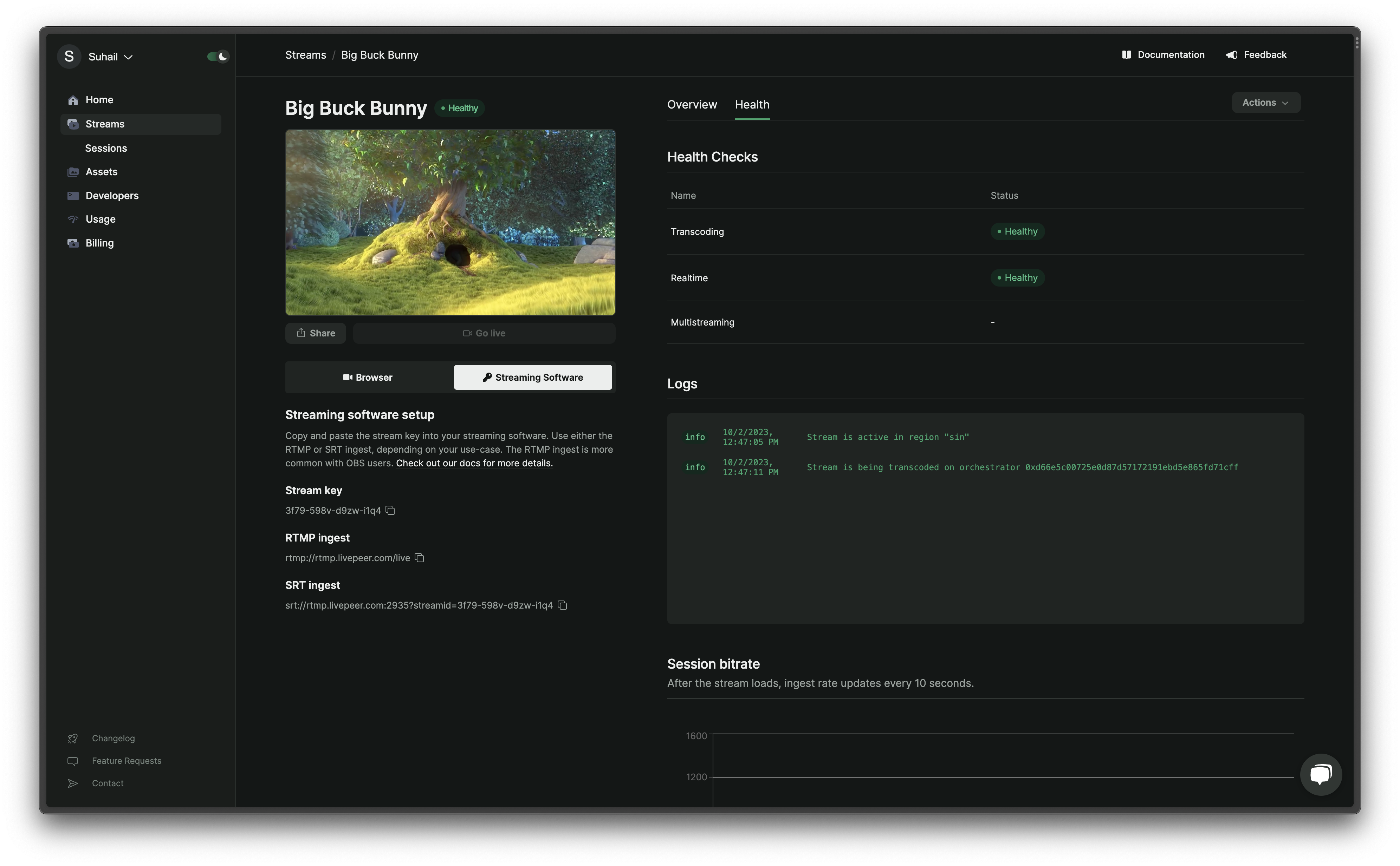
Stream Health is a multi-faceted indicator representing the operational and
performance status of a video stream within Livepeer.
- Global Health Status is a holistic status of the stream. It can be one of
the following:
Healthy: All health checks are in a good state.
Unhealthy: One or more health checks indicate a problem.
Idle: The stream is not currently active.
- Health Checks are specific metrics that contribute to the global health
status of the stream. They include:
- Transcoding: Shows if video transcoding is successful and multiple
stream profiles are available for playback. An unhealthy status implies
only the original video is available.
- Real-time: Indicates if the stream is transcoded faster than in
real-time, meaning the latency of the transcoded video is less than the
duration of the original video.
- Multistreaming: Reflects the connection status of all configured
multistream targets. It can show the following states:
Idle: Stream and multistreaming aren’t active.
Pending: The system is trying to connect to the multistream target.
Online: Successful connection to the multistream target.
Offline: There was an error connecting to the multistream target.
- Logs provide alerts and error messages related to the streaming process.
This includes notifications such as when the stream starts/stops or if there
are any fatal errors during the transcoding process.
- Session Ingest Rate is a measure of the bitrate of the video being
received by Livepeer servers. It’s updated every 10 seconds. A high, stable
bitrate indicates good stream quality and a reliable internet connection,
while a fluctuating or low bitrate might point to potential issues with the
encoder or the streamer’s internet connection.
- Monitoring Tools allow for a detailed view with:
- Studio: Offers a visual representation with health indicators for an
active stream, including a chart showing the ingest rate.
- REST API & SDK: Allows for querying the health information of a stream,
including detailed metrics and events sent by the Livepeer video-processing
services.
- Health Metrics (from API) allows you to retrieve detailed metrics about
the stream’s health. This includes:
- Conditions: These represent specific states of stream health, such as
whether the stream is active, if it’s transcoding in real-time, and if
there are no errors during transcoding. Each condition provides a status,
frequency, and timestamps for when the condition was last checked and when
it last changed.
- Metrics: Experimental at the time of the document, they provide
specific measurements related to stream health.
By monitoring and analyzing these various options, users can ensure the optimum
performance and reliability of their streams on Livepeer. Last modified on April 11, 2026